
Key takeaways
- What fills the page decides what you can save. Handwriting sheets, coloring pages, reading passages and word searches covered only about 1 to 6% of the paper on average in our tests, so there is little to save.
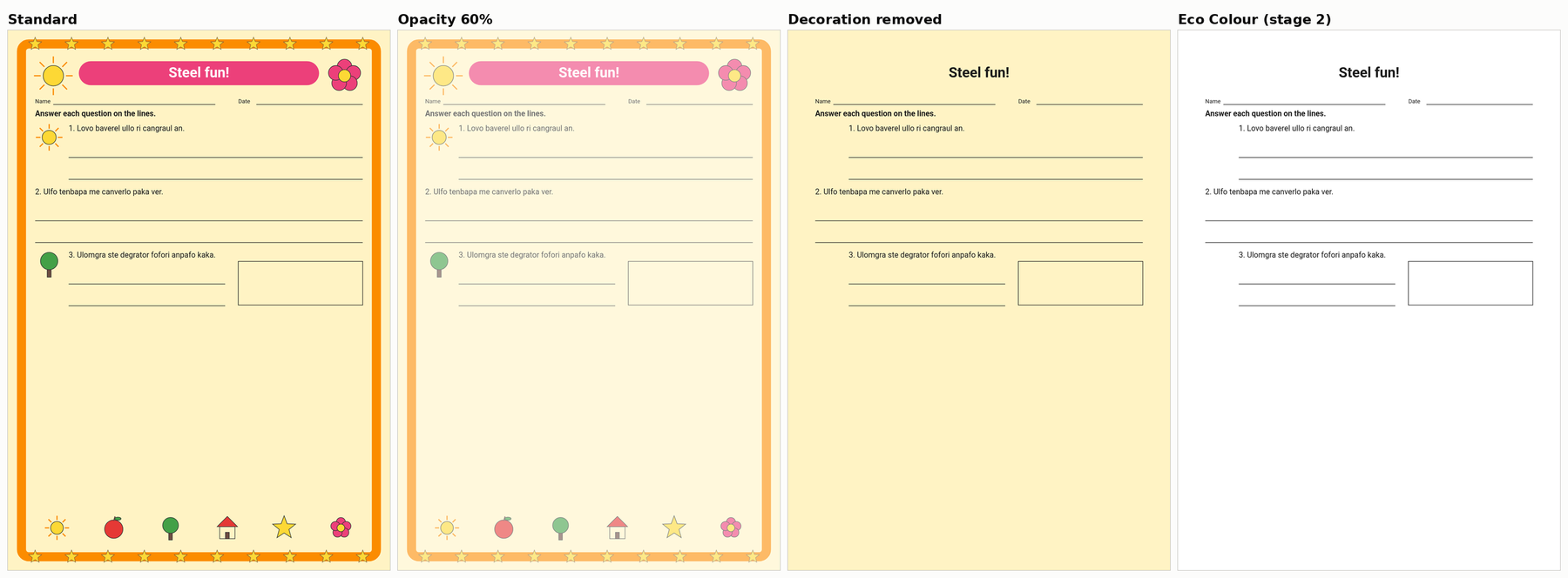
- Removing backgrounds, borders and clip art cut estimated coverage by about 60 to 97% on average on our two decorated designs (45 to 99% page by page).
- Printing everything lighter cuts estimated coverage in proportion to the fade, but every mark still prints and text on colored shapes loses contrast first.
- Grayscale keeps every shade just as dark. Hard black and white failed on more than half of our pages.
- Dot patterns never meaningfully beat a plain lighter color, and in our simulated copier only dark, bold masters kept their guide lines.
What our numbers measure. We measured how much of each page a printer is asked to cover, and how dark. We did not weigh ink or toner, so every percentage here means "less on the page", not a promise about your cartridge. The test pages were made by computer to stand in for common worksheet types.
Start here: what fills the page?
| If most of the page is | Do this | Avoid |
|---|---|---|
| Background, border, banner or clip art | Use a version without the decoration | Printing everything lighter |
| Big blocks of color (posters, card backs) | No background, lighter fills, dark text | Outline-only, if the color is the point |
| Color that means something | Keep the colors, add labels | Grayscale or black and white |
| Photos or pictures | Lighter fills and photos, text unchanged | Printing much lighter |
| Text and grids | Print it as it is | Fading, unless every point matters: under 1.5 points saved on average, text contrast more than halved |
| Thin lines, tracing letters, copy masters | Print it as it is | Any version that prints lines or text lighter |
These are our recommendations from the results. For text pages, word searches and coloring pages the study's own best trade-off was a 75% fade; we advise against it because the saving is so small and the contrast cost is real.
What actually saves printer ink?
Removing marks the page does not need. A deleted background or border is simply not printed. Printing a page lighter works differently: every mark still prints, only paler, so the share of the page carrying some mark barely moves.
How much you can save depends on what covers the page. A handwriting sheet covered 1.5% of the paper in our tests and a coloring page 1.1%, while a decorated worksheet covered 42%, almost all of it decoration, and a poster 80%.
Tested in the UltraTextGen Printable Ink Efficiency Study: what covers each kind of page, and how much each method removed.
Which techniques save the most?
On pages with backgrounds, borders or big color areas, the combination with the largest cuts that still passed our checks was to remove the background and decoration, lighten the remaining color fills, and keep text and lines at full strength. That cut estimated coverage by 61% on posters, 76% on cut-out cards and 97% on a decorated worksheet (averages per design).
Printing the whole page lighter cut coverage in proportion to the fade: a 75% version covered about 26% less. On text and line pages that is under 1.5 percentage points of the page on average (up to 2.3 on the densest word search).
Tested in the UltraTextGen Printable Ink Efficiency Study: the best trade-off found for each of 12 page types.
What hurts readability?
- Fading text that sits on color. At 75% strength, dark labels on bright card colors fell below the usual contrast guideline (4.6:1 to 2.8:1), and white labels on colored poster shapes, already below it as designed, fell further (2.4:1 to 1.9:1). White text needs to turn dark when its background gets lighter.
- Fading near-black text too far. Near-black text on white stayed just above the usual 4.5:1 contrast line at 60% strength (4.54:1) and fell below it at 55%. Text that starts as dark gray crosses the line sooner. These checks assume a lighter color prints as a flat tone; printers print it as dots, so faded text may do worse on paper.
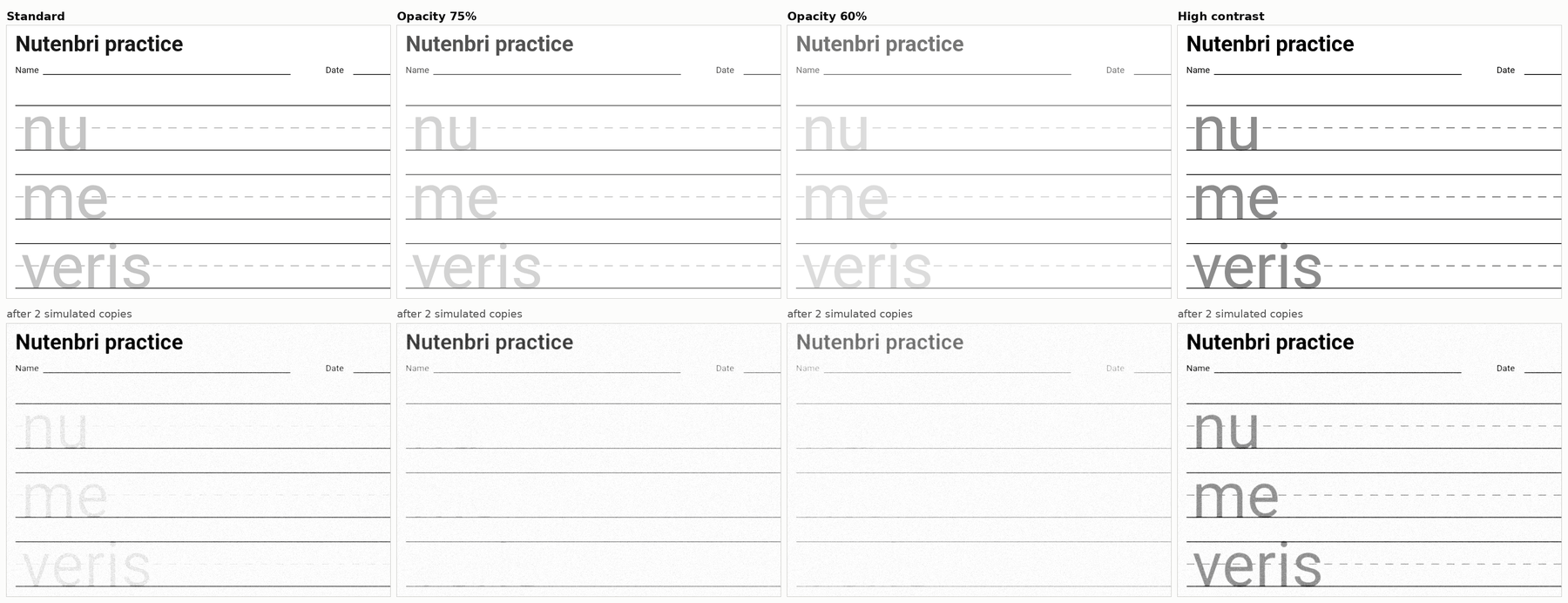
- Fading gray guides and tracing letters. They were the first marks lost, on the page from 60% strength and on simulated photocopies already at 90%.
- Hard black and white. Converting a page to pure black and white failed on 62 of 108 pages: pale lines vanished, white text disappeared, photos turned into blobs.
Tested in the UltraTextGen Printable Ink Efficiency Study: contrast, visibility and simulated-copy checks for every method.
When should I use grayscale?
Use it when you are printing on a black-only printer or copier anyway, and when color does not carry meaning on the page. Do not use it expecting a lighter page: grayscale keeps every shade just as dark and changes only which ink the page asks for. It also merges colors of similar lightness, so a color-sorting task can stop working (grayscale failed 6 of our 9 color-key pages).
Tested in the UltraTextGen Printable Ink Efficiency Study: grayscale left the page's darkness unchanged and merged four pastel colors into almost the same gray.
When should I use lighter fills?
On posters, card backs and picture cards, where large color areas carry the coverage. Lighten the fills and keep text and lines dark. Fills at 55% strength kept strong color categories apart for normal color vision; pale pastel colors lost half their distinctions, and lightening made one red and green pair harder to tell apart in a color-blindness simulation. If color carries meaning, add a label, letter or pattern too.

When is outline-only useful?
On decorated pages, and on card backgrounds with care (it failed one of our nine cut-card pages), where the color is decoration. It failed on every poster and on most picture cards, where the fill is the content. One trap: if white text sat on a filled shape, an outline-only version must turn that text dark, or it vanishes. The version that did not lost every word on all nine test posters.
What about black and white?
Pure black and white is one of the riskiest shortcuts we tested. A 1-bit conversion failed on 62 of 108 pages. A more careful version kept text and lines but turned gray tracing letters solid black: still visible, but no longer lighter than the lines a child writes on.
Do halftone or dither patterns save ink?
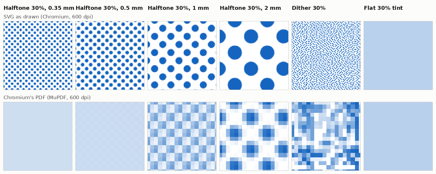
Not in our coverage estimates. As drawn in the browser, a dot pattern with 30% of its area inked covered about the same tone as a plain color at 30% strength, never meaningfully less and up to 19% more. Coarse patterns also show visible dots, and the files are far larger: PDFs a median of about 20 to 28 times bigger, and up to about 1,400 times.
Tested in the UltraTextGen Printable Ink Efficiency Study: the dot patterns compared with equally light flat colors.
What fails or changes in PDFs?
In the browser we tested (Chromium), the PDF export stored every dot-pattern fill as a coarse 72-pixels-per-inch image. Fine dots became a flat, lighter tone and coarse dots became blocky squares, so the PDF no longer contained the pattern that was designed. If you make worksheets, change the colors themselves rather than applying a CSS or SVG filter: in the same browser, a filter turned the whole PDF page into an image and lost its text.
Tested in the UltraTextGen Printable Ink Efficiency Study: what the exported PDFs actually contain.
When should I leave the design unchanged?
- Handwriting and tracing sheets. They cover about 1.5% of the paper, and every option that lightened the lines faded the guides first.
- Pages you will photocopy. Many copiers have background suppression, built to drop pale background tones. In our simulated copier, thin gray guides and pale tracing letters were gone after two copies even on the unchanged page, and a faded master lost them on the first copy. A darker, bolder master was the only kind that kept them all; it covers more of the master (up to half as much again on our handwriting sheets, under 1 percentage point of the page on average). If you photocopy a class set, a pale background may already drop out on the copier, so removing it mainly saves on the master.
- Text pages for reading. A 75% version saves about 0.8 of a percentage point on a reading passage on average (up to 1.3) and more than halves the text's contrast. It was the study's own best trade-off for reading passages; we advise against it because the saving is so small.
Tested in the UltraTextGen Printable Ink Efficiency Study: for handwriting sheets and photocopy masters, no method kept function and copies with a real saving.
How we tested this
We rendered 108 computer-generated worksheet pages, 12 types at three fullness levels and three element sizes, in 36 ways plus the unchanged version, then measured estimated coverage, contrast, visibility and survival through a simulated photocopier. 36 more pages of four unseen types checked the recommendations. The full record, with its method, data and limitations, is the Printable Ink Efficiency Study, also available as a downloadable PDF of the full study.
General printing advice we did not test
These points come from printer makers and other published sources, not from our study.
- Grayscale may still use color ink. Epson, Canon and HP each say their inkjet grayscale or black printing can use some color ink.
- Toner-save modes print lighter. Brother says toner save makes print appear lighter, and Canon warns that fine lines and light areas may be less sharp. Expect the same weaknesses as a faded page, and check a printed guide line before a class set.
- Many copiers can suppress light backgrounds. Xerox describes background suppression that reduces sensitivity to light background colors.
- Color alone is not enough. Red-green color blindness affects about 1 in 12 boys of Northern European descent, and fewer in some other populations.
That grayscale printing can still use color ink is stated in Epson's Black Ink Only and Grayscale FAQ, Canon's guide to printing a color document in monochrome and HP's Ink Usage in Inkjet Printers.
The toner-save behavior is from Brother's Toner Save Mode FAQ and Canon's Saving Toner manual page.
Copier background suppression is described in Xerox's support article on automatically suppressing background variation.
The 4.5:1 contrast line for normal text is from the W3C's Web Content Accessibility Guidelines 2.2, a screen standard used here as a proxy for print.
The color-blindness figures are from Almustanyir's review, A Global Perspective of Color Vision Deficiency (Healthcare, 2025).
Saving Printer Ink on Worksheets: FAQ
Does printing in grayscale save ink?
Not by itself. Grayscale keeps every shade just as dark, so the page asks for the same amount of tone; it only changes which ink is requested. Some printer makers also say their grayscale modes can still use color ink.
Does printing lighter save ink?
It covers less of the page, roughly in proportion to the fade: a 75% version covered about 26% less in our tests. But every mark still prints, text on colored backgrounds lost contrast first, and thin gray guides were lost on simulated photocopies.
What saves the most ink on a worksheet?
Removing what the page does not need. On our two designs where decoration made up most of the coverage, removing it cut estimated coverage by about 60 to 97% on average (on a mixed worksheet with a small banner, about 29%). The text and answer lines still passed our contrast and visibility checks, though decoration itself was never one of the things we checked.
Do dot patterns or halftones save ink?
No. In our tests a dot pattern covered about the same tone as an equally light plain color, never meaningfully less, and made PDFs up to about 1,400 times larger. The browser's PDF export also turned the dots into coarse pixel blocks or, for fine dots, a flat lighter tone.
Should I print a lighter version of a sheet I will photocopy?
No. Many copiers have background suppression, built to drop pale background tones. In our simulated copier, a faded master lost its gray guide lines on the first copy, and even the unchanged master lost them by the second. A darker, bolder master was the only version that kept every guide line through the simulated copies.