Pick a graffiti letter
Tap a letter (A–Z) or a number (0–9) for a big graffiti-style outline you can print, trace or download as a PNG.
Graffiti style
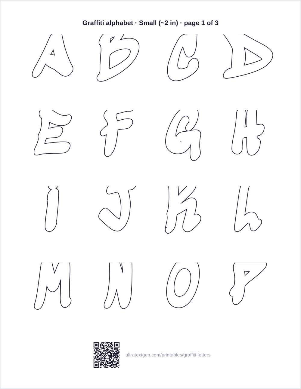
Want the whole graffiti alphabet? Print A–Z and 0–9 in one go: a single sheet, or a practice book with one letter per page.
Print size
Want your name in graffiti?
Type it into the graffiti name generator: five styles, your own fill and outline colours, and a printable outline, a PNG or a transparent PNG for stickers and thumbnails.
Which graffiti style is this?
Graffiti lettering is not one alphabet, and knowing which one you are looking at saves a lot of frustration when you start copying it:
- Throw-up / bubble Fat, rounded, slightly overlapping letters. This is the style on this page, and it is where almost everyone starts, because the shapes are forgiving and they read cleanly at any size.
- Blockbuster Straight-sided, heavy, rectangular capitals built for scale and legibility. Closest printable equivalent here is block letters.
- Wildstyle Interlocking, arrowed, heavily abstracted letters. Wildstyle is drawn by hand around a specific word. It is a composition, not a font, which is why no alphabet sheet can hand it to you ready-made.
So the honest version: the sheets here give you a throw-up alphabet to trace and build on. Wildstyle is what you grow into once these shapes are automatic, and the how-to below is the bridge.
How to draw graffiti letters
Every graffiti letter is a normal letter wearing a coat. Build the plain letter first and the graffiti version follows; try to draw the finished shape straight away and it collapses.
- 1 · Skeleton Pencil the plain letter thin and light. This is the frame everything else hangs on.
- 2 · Inflate Draw a fat outline about a finger's width around every stroke, letting the curves bulge outward.
- 3 · Overlap and tilt Push each letter slightly over its neighbour and angle them a few degrees, so the word reads as one connected piece rather than separate letters.
- 4 · Keyline and fill Ink the outline, erase the skeleton, add a second line a few millimetres outside it, then fill the inside.
The fastest way to get the shapes into your hand is to print a letter above at full size and trace it five or six times before trying it freehand. Muscle memory does more here than any amount of reading.
Print, trace, colour
- Trace The hollow outline is made to be traced: put a thin sheet on top and go over it until the shape comes naturally.
- Colour The inside is left white on purpose: markers, pencils and paint all work, and the thick outline keeps the edge crisp.
- Sketchbook practice Print the A–Z as a book, one letter per page, and work through it a letter at a time.
- Posters and banners Cut the letters out for door signs, birthday banners and school projects.
Prefer softer, rounder shapes without the graffiti framing? Those are bubble letters. Want straight-sided stencils instead? Use block letters.
Want graffiti-style text you can paste, not print?
Type once and copy decorated Unicode text that pastes into bios, captions and usernames, with no image involved.
Open the font generator →