What the study found
-
5 of 12
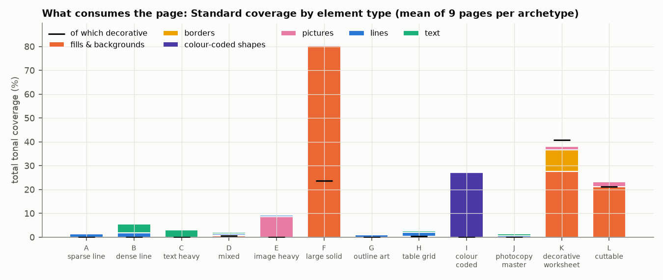
page types cover under 3% of the paper as designed
For handwriting sheets and photocopy masters, the best trade-off found was to leave the page unchanged.
-
60 to 97%
less from removing decoration and lightening fills
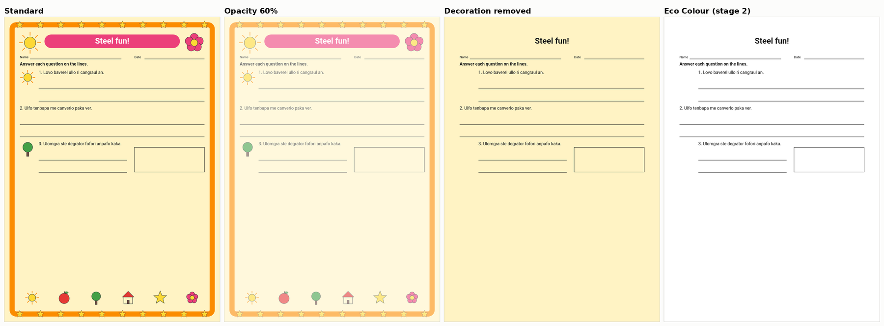
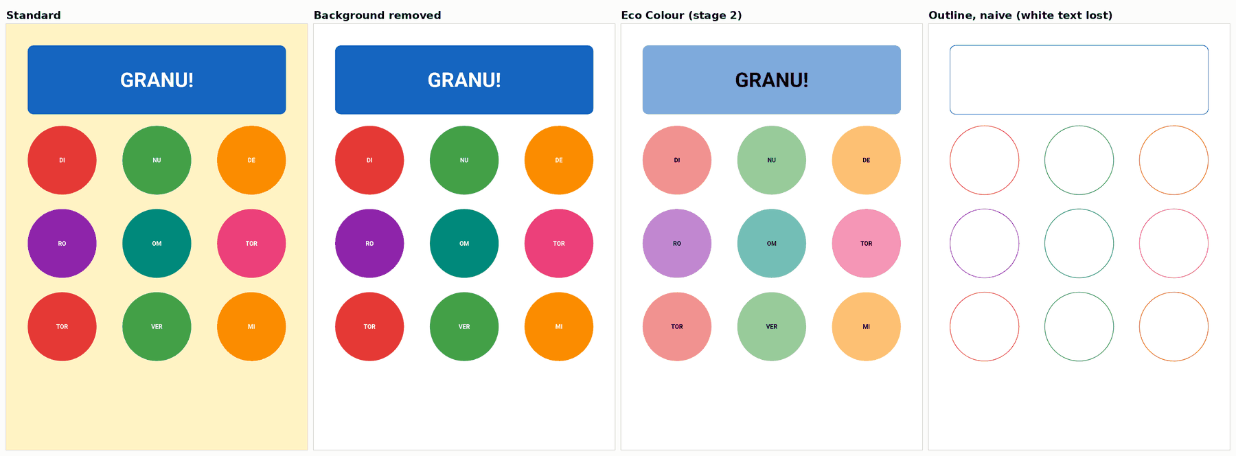
On the poster, cut-card and decorated-worksheet designs, where backgrounds, borders or large color areas carry most of the coverage, removing decoration and lightening fills cut estimated coverage by about 60 to 97% on average per design (49 to 99% page by page). Text, lines and pictures still passed the checks, a result that is partly true by design because decoration was never a checked element.
-
About 26%
less from fading the whole page to 75%
Page-wide fading cuts coverage in proportion to the fade (75% strength: about 26% less) and removes no mark. Page opacity already failed 12 of 108 pages at 75%.
-
4% at most
less tone from dot patterns than a flat tint
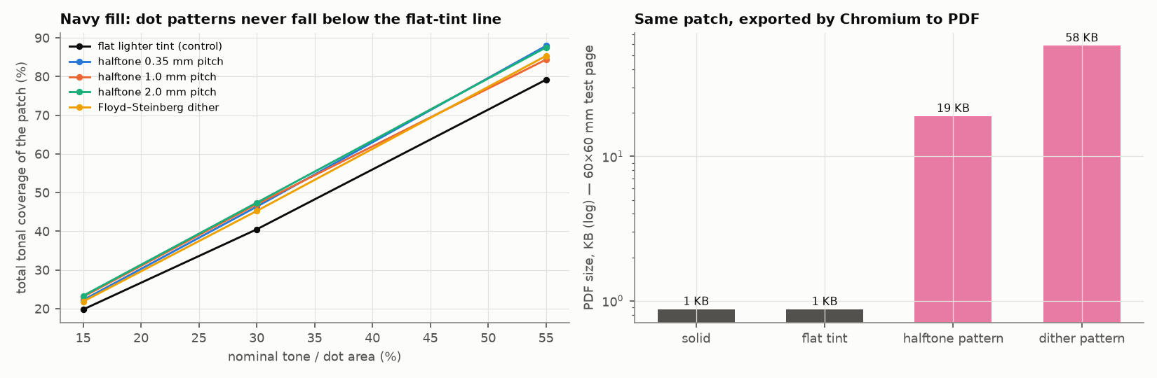
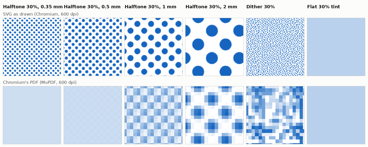
As drawn in the browser, authored dot patterns never meaningfully beat an equally light flat color. Chromium's PDF export then stored them as 72 ppi images, so the file a user prints no longer carries the designed pattern.
Not tested on printers What these numbers do not show yet
How to read the numbers. Every percentage on this page is estimated printed coverage, calculated from rendered pages. No ink or toner was weighed. Lower coverage is likely to need less ink or toner, but on laser printers the toner used per covered area is known to differ between solid areas, dot patterns and text edges, so a 30% cut in coverage is not necessarily a 30% cut in toner.
Physical printer validation has not been run, and the visual reviewers were AI models. Read the limitations
Best trade-off by page type
Pages that cover a quarter of the paper or more lost 48 to 98% of their estimated coverage under the best trade-off. Pages under 6% had 1.4 points or less to gain.
| Page type | Coverage as designed | Best trade-off found | Estimated cut |
|---|---|---|---|
| Covers a quarter of the page or more | |||
| Poster | Eco Colour | ||
| Decorated worksheet | Remove decoration, then 75% | ||
| Color key | Eco Colour, text and lines at 75% | ||
| Cut-out cards | Decoration removal | ||
| Covers about a tenth of the page | |||
| Picture cards | Lighter fills and photos (55%) | ||
| Covers under 6% of the page | |||
| Word search | 75% page opacity | ||
| Reading passage | 75% page opacity | ||
| Table or schedule | Remove decoration, then 75% | ||
| Mixed worksheet | Eco Colour | ||
| Handwriting sheet | Leave unchanged | ||
| Photocopy master | Leave unchanged | ||
| Coloring page | 75% page opacity | ||
For each page type, the method with the largest cut on both coverage estimates among those that kept function on average over the type's 9 pages, kept at least 90% of the unchanged page's marks through simulated copies, were rated at least 4 out of 5 by the AI reviewers and did not inflate the PDF. Within 2 points, the simpler method won.
Points are percentage points of estimated coverage. Two picks depend on how "kept function" is applied: if every page, not the average, must score at least 0.90, cut-out cards move to lighter fills; at 0.95, cut-out cards move to leave unchanged and picture cards to 75% opacity. Where 75% opacity was picked, it more than halves text contrast (17.4:1 to 7.7:1 for near-black text, still above the 7:1 enhanced line) to save 0.3 to 1.4 points, so we would not use it for low-vision readers or long reading; no reader was tested. Rankings that compare faded text against removed fills are coverage rankings only; they need a physical test before they can be read as ink rankings.
Printing worksheets yourself? How to Save Printer Ink on Worksheets turns these results into steps, and keeps what this study tested apart from general printing advice.
What worked and what did not
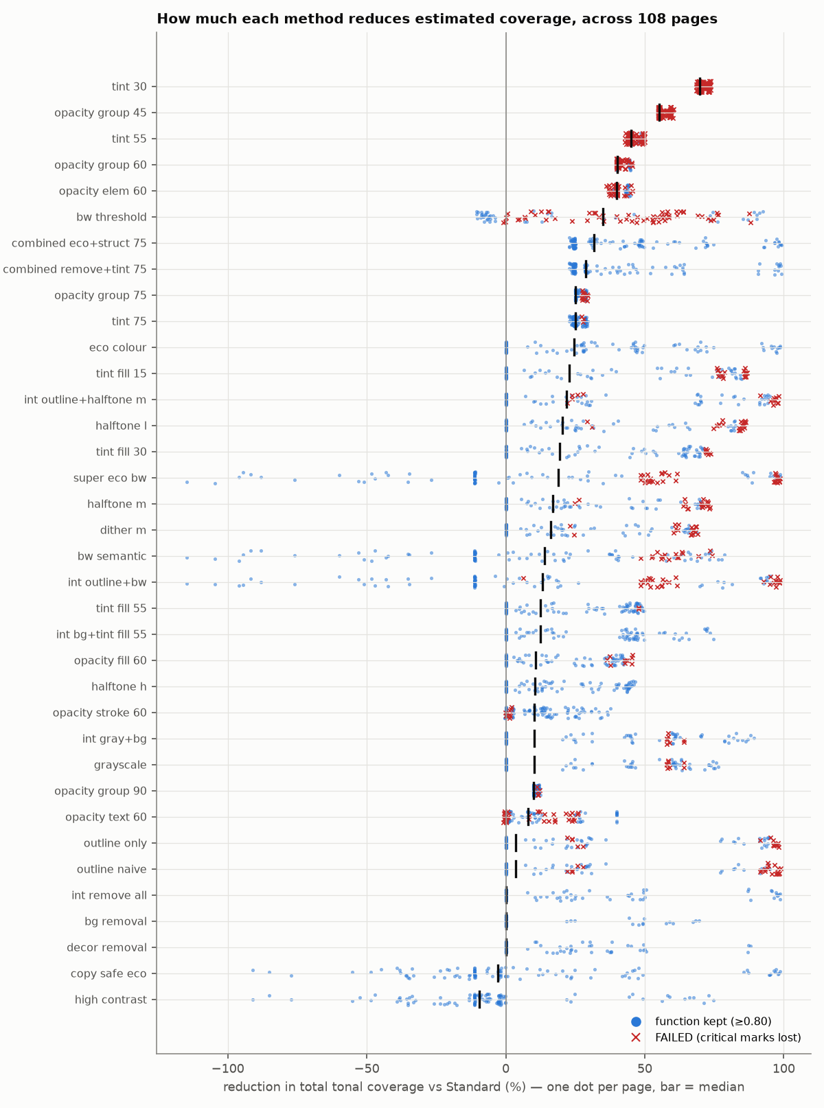
Twelve of the 36 methods, across all 108 development pages: the mean cut in estimated coverage with its range from the lowest to the highest page, and how many pages failed the function check.
| Method | Mean cut, 108 pages | Pages failed | What to know |
|---|---|---|---|
| Cut where there is color to remove, with few or no failures | |||
Eco Colour ECO_COLOUR |
Removes background and decoration, fills to 55%, photos to 80%, text and lines unchanged. It changed nothing on 45 of 108 pages, which have no fills or decoration. | ||
Decoration removal DECOR_REMOVAL |
62% on cut-out cards; nothing to remove on pages without decoration. | ||
Lighter fills (55%) TINT_FILL_55 |
Fills and pictures only; text and lines unchanged. The best trade-off found for picture cards. | ||
| Small, even cut on every page; fails where text sits on color | |||
Page opacity 75% OPACITY_GROUP_75 |
Removes no mark. Failed all 9 posters and 3 dense cut-card pages. | ||
Lighter solid color 75% TINT_75 |
Same coverage as page opacity, but re-colors white text dark when its fill lightens. Failed only 3 cut-card pages. | ||
| Cut more, and broke many pages | |||
Page opacity 60% OPACITY_GROUP_60 |
Failed every handwriting and cut-card page and 8 of 9 photocopy masters. | ||
Lighter solid color 55% TINT_55 |
Near-black text falls below the 4.5:1 line at 55% strength. | ||
Page opacity 45% OPACITY_GROUP_45 |
Failed every page. | ||
Black and white, 1-bit threshold BW_THRESHOLD |
Thresholding the rendered page to 1-bit is unreliable. | ||
| No real saving, or a new problem | |||
Grayscale GRAYSCALE |
Removes no tone: the single-color darkness estimate moved 0.0%. The four-color figure falls only because color moves to black. Merged pastel color categories. | ||
Halftone dots, 30% area HALFTONE_M |
Never meaningfully beat an equally light flat tint. Chromium stored it as a 72 ppi image, and its PDFs were a median 21 times the size. | ||
Outline, naive OUTLINE_NAIVE |
Does not re-color white text on fills: lost every word on all 9 posters. | ||
A page fails below a function score of 0.80. The range bar runs from the lowest to the highest page, on a scale from −20% to 100%, and the tick marks the mean; a negative cut means the method added coverage. Values come from summary-by-mode.csv; all 36 methods are in the dot plot below.
Chromium-specific How a method is built changes the file. Grayscale or lightening applied as a CSS filter or an SVG filter exported the page as an image with no text layer; plain group opacity stayed vector. Chromium and PDF behavior
What the study asked and what it can conclude
- Question
- Which ways of rendering a printable page reduce how much of the page a printer is asked to cover, without damaging what the page is for?
- What was tested
- 36 rendering methods, compared with the unchanged page: page-wide fading, lighter solid color, lighter fills only, grayscale, two kinds of black and white, outline-only, background and decoration removal, halftone and dither patterns, high contrast, and ten methods built from the first round of results (five combined methods and five pairs that test how savings combine). Each was applied to 108 computer-generated pages (12 worksheet types, each at 3 fullness levels and 3 element sizes). 84 replicate pages, rendered with a reduced set of 14 methods, checked other content and US Letter paper, and 36 pages of 4 unseen types were held back to test the recommendations.
- What was measured
- Estimated printed coverage from the rendered pixels; whether each page's critical elements kept their visibility, text contrast and color separation; survival through a simulated photocopier; file size and render time; and what the exported PDF actually contains. The study produced 6,616 measurement rows.
- What it can conclude
- How much estimated coverage each method removes on each kind of page, and what each method breaks, in the tested conditions.
- What it cannot conclude
- How much ink or toner any method saves on a real printer, or how real readers judge the pages. Physical printer validation has not been run, and the visual reviewers were AI models.
- 1 · Build 108 pages 12 worksheet types, 3 fullness levels, 3 element sizes, on A4
- 2 · Render 36 methods Each compared with the unchanged Standard page in headless Chromium 141
- 3 · Measure 6,616 rows Coverage, function checks, simulated copies, file size and PDF contents
- 4 · Replicate 84 pages Other content seeds and US Letter, with 14 methods
- 5 · Hold out 36 pages 4 unseen types, rendered after the routing rules were committed
- 6 · Not yet run Printers Weighing ink and toner on inkjet, ink-tank, mono laser and color laser: designed, not executed
Detailed findings
Each finding carries a tag for the kind of evidence behind it.
- Estimated coverage measured from rendered pages
- Function check measured contrast, visibility or color separation against a stated threshold
- Simulated produced by a model, not a real device
- Chromium-specific a property of the Chromium build used (141)
- Not tested on printers an open question for physical testing
- Physical printer test measured on a real printer: none in this version
Estimated coverage
- Estimated coverage
What covers the page decides what can be saved. As designed, five page types cover under 3% of the paper: coloring page 1.1%, photocopy master 1.4%, handwriting sheet 1.5%, mixed worksheet 2.1%, table 2.8%. The decorated worksheet averaged 41.7%, of which 40.7 points were decoration. Posters averaged 80%.
- Estimated coverage
Page opacity and an equally light solid color produce the same coverage. Across 108 pages they differed by 0.02 points on average and 0.11 at most. At 75% strength, page opacity cut estimated coverage by 26.1% and lighter solid color by 25.8%. At 60% opacity the cut was 41.4%.
- Estimated coverage
Fading removes no mark. The share of the page carrying any mark fell 0.1% under 75% opacity, against 16 to 35% under decoration removal, Eco Colour or outline conversion.
- Estimated coverage
Removing decoration is the largest lever where decoration exists. Removing background and decoration cut 97% on the decorated worksheet (the tinted background alone, 59%), 62% on cut-out cards and 94 to 98% on the unseen certificates. This saving equals the share of each page the designs gave to decoration, so it describes these designs, not real worksheets.
- Estimated coverage
Eco Colour (remove background and decoration, fills to 55% strength, photos to 80%, text and lines unchanged) cut 61% on posters, 97% on the decorated worksheet, 76% on cut-out cards, 47% on the color key, 33% on the mixed worksheet and 28% on picture cards. It changed nothing on 45 of 108 pages, which have no fills or decoration.
- Estimated coverage
Grayscale removes no tone. The single-color darkness estimate moved 0.0% on average (−0.8% to +0.8% by page). The four-color estimate fell 27.3% only because color moved to black; if a device built grays from color inks, the fall would be 2.6%.
- Estimated coverage
Dot patterns never meaningfully beat a flat tint. Against an equally light flat color, halftone and dither patches measured at most 4% less and up to 19% more total tone (median ratio 1.03; single-color darkness within 5%).
- Estimated coverage
Combined methods multiply, not add. On posters, background removal plus lighter fills saved 51.7 points, against 62.4 by adding the two and 51.1 by multiplying their remaining shares. Across all pairs the multiplicative prediction was 0.5 points off on average; single pages were up to 13.4 points off.
- Estimated coverage
Absolute savings shrink with coverage. For 75% page opacity, no page under 3% coverage gained a full point with its function kept; the lowest-coverage page that did started at 4.4%.
Function checks
- Function check
Page opacity fails first where text sits on color. At 75% opacity, 12 of 108 pages failed: all 9 posters, where white 12 pt labels, already below the 4.5:1 line as designed (2.4:1), fell to 1.9:1 against their fills, and 3 dense cut-card pages, where dark labels on pink card fills fell from 4.63:1 to 2.76:1. The lighter-color version re-colors white text dark when its fill lightens; it passed the posters and failed only those 3 cut-card pages.
- Function check
Near-black text crosses the 4.5:1 line between 60% and 55% strength. #1a1a1a text on white measures 7.69:1 at 75%, 4.54:1 at 60% and 3.90:1 at 55%. Text that starts as dark gray crosses much earlier. On the decorated worksheet the white banner title (large text, 3:1 line) fell to 2.79:1 at 75%; dark text on its pale yellow background held 7.10:1 at 75% and fell to 4.26:1 at 60%.
- Function check
Stronger fading fails many pages, and every page by 45%. 60% page opacity failed 46 of 108 pages, including every handwriting and cut-card page and 8 of 9 photocopy masters; 55% lighter color failed 83; 45% opacity and 30% lighter color failed all 108.
- Function check
Hard black and white is unreliable. Thresholding the rendered page to 1-bit failed 62 of 108 pages. A per-element conversion kept text and lines but turned gray tracing letters solid black (+86% coverage on handwriting pages); the automated check missed this, and the AI reviewers scored it 2 out of 5 (their brief had listed this defect as an example).
- Function check
Knockout text is the implementation trap. Removing or outlining fills without re-coloring the white text on them lost every word on all 9 posters.
- Function check
Color categories. Grayscale reduced four pastel categories to a color difference of 0.2 (CIEDE2000; 10 was the distinguishable line) and failed 6 of 9 color-key pages. Lightening fills to 55% kept saturated categories apart for normal color vision. In a deuteranopia simulation, the key's weakest red and green pair, already below the distinguishable line of 10 as designed (5.2), fell to 2.9.
- Simulated
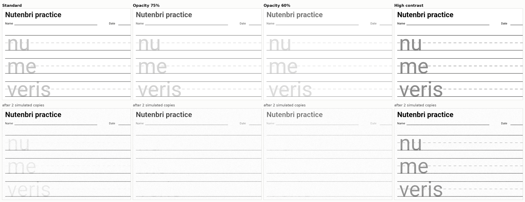
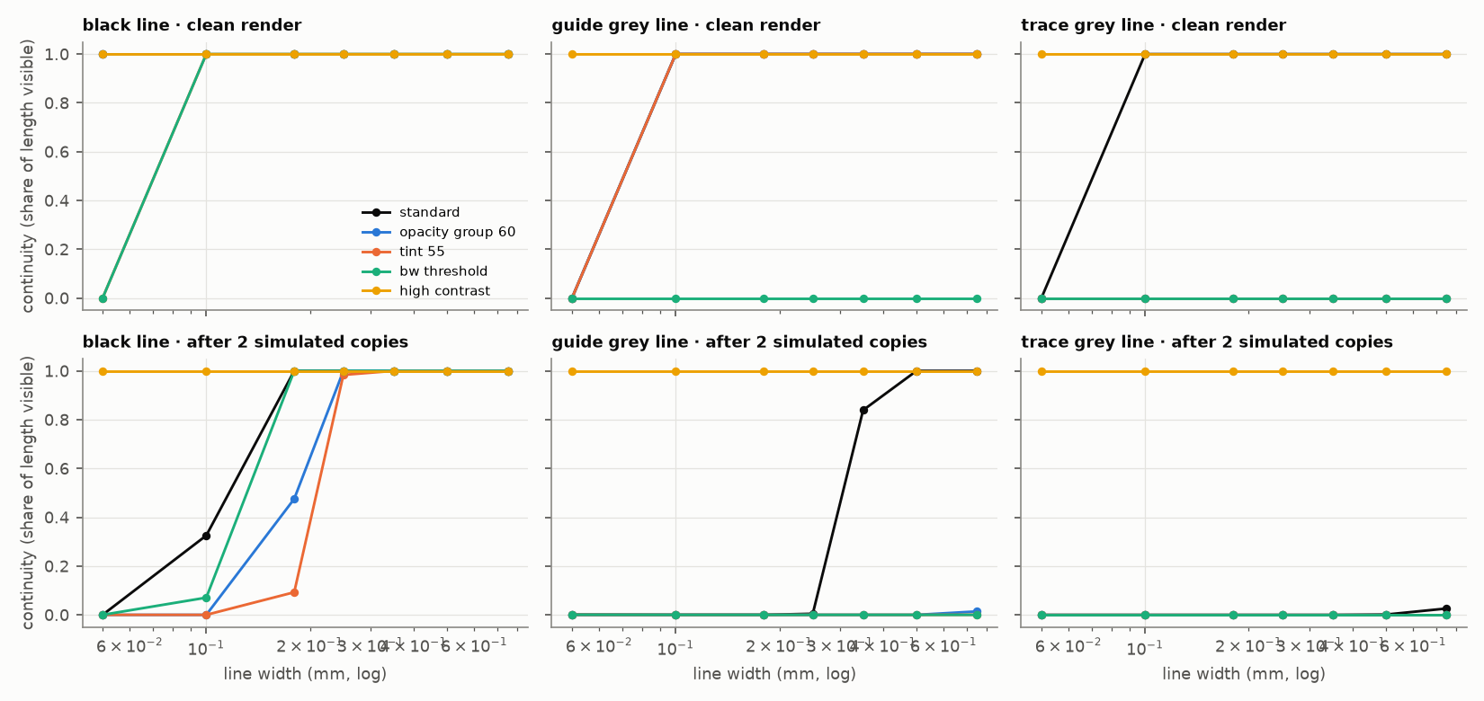
Copies suffer before the original. In the simulated copier, the worst-hit lines or text at 75% opacity kept 81% as many visible marks as the unchanged page's own copies on medium-size pages and 62% on small-element pages; at 60%, 67% and 36%. Two simulated copies erased pale flat tints outright.

Chromium and PDF behavior
- Chromium-specific
Chromium's PDF export does not keep dot patterns. Every pattern-filled shape was written as its own full-page 72 ppi image with an alpha mask, not as vector dots. At 0.35 to 0.5 mm spacing the PDF holds a flat, lighter tone; at 1 to 2 mm, blocky aliased dots. Flat tints stay vector. So the halftone results above describe the pattern as drawn in the browser, not the file a user would print.
- Chromium-specific
Chromium's PDF of a fine pattern is lighter than the design. MuPDF and PDFium showed 0.35 to 0.5 mm halftones 8 to 39% lighter than Chromium's own raster of the same design, while agreeing with each other within 6%. Flat methods agreed within 1 to 5% across all four renderers.
- Chromium-specific
Pattern files are large and slow. Page PDFs with patterns were a median 19 to 21 times (halftone) and 28 times (dither) the size of the unchanged page, up to 148 MB and 198 MB for one A4 page, and the slowest single export took 723 seconds (timings are upper bounds: the machine was not idle for part of the run). Flat methods rendered and exported within a few percent of the unchanged page, except per-element and text-only opacity, whose PDFs were a median 1.5 and 1.1 times larger (up to about 12 times).
- Chromium-specific
Filter-based implementations rasterize the whole page. Grayscale or lightening applied as a CSS filter or an SVG filter exported the page as an image with no text layer; plain group opacity stayed vector.
Not yet validated on physical printers
- Not tested on printers
Whether any cut in estimated coverage becomes a matching cut in ink or toner, for each method and printer type.
- Not tested on printers
Whether grayscale saves anything on a given printer; several manufacturers say grayscale modes can still use color ink.
- Not tested on printers
Whether faded text and gray guides survive a printer's own dot screening. Every contrast figure here assumes a lighter color prints as a flat tone.
- Not tested on printers
Real copier behavior. The copier is a model with chosen settings, and the finding that pale tints vanish while coarse dots survive comes from those settings.
- Not tested on printers Simulated
The simulated printer screen gave halftones a median 1.31 times, and dithers 1.24 times, the dot area of the equal flat tint.
How the recommendations held on unseen pages
The routing rules were written down and committed before four held-back page types (a certificate, a maze, a month planner and a labeled diagram, 36 pages) were rendered.
- Not exercised
Every holdout page was routed to the same method, Eco Colour, so the rules for pictures, sparse pages and text-and-line pages were not exercised.
- Held
Function was kept on all 36 pages for normal color vision, which mostly confirms that Eco Colour leaves text and lines alone.
- Held
The decoration rule's coverage prediction held: certificates lost 94 to 98% of their estimated coverage, 99% of the best available. Whether a certificate still works as an award without its frame was not assessed.
- Failed
The color rule failed. Planners and diagrams saved 47 to 65%, but a more aggressive fill lightening saved more on every one. On the maze, color meaning is two small start and finish dots while the coverage is black walls: Eco Colour saved 1 to 7% where 45% was available. Routing by what covers the page, not by page type or feature, is the lesson; that rule itself has not yet been tested on unseen pages.
How the study was run
Pages
Every page was generated from code, so one property could change at a time. Twelve development types were each built at three fullness levels (30%, 60% and 92% of the usable area populated) and three element sizes (for example 16, 12 and 9 pt body text; 0.40, 0.25 and 0.15 mm guide lines) on A4 with 15 mm margins: 108 pages. Replicates rebuilt each type's typical page with four more content seeds (48 pages) and its three medium-size pages on US Letter (36 pages), with a reduced set of 14 methods; seeds change words and picture choice, not layout. Text is pseudo-words; pictures are simple vector clip art and procedural photographs.
The 12 page types and their critical elements
| Page type | Stands in for | Critical elements |
|---|---|---|
| Sparse lines | Handwriting practice, tracing | Ruled lines, guides, tracing letters |
| Dense lines | Word searches, grids | Grid, letters |
| Text heavy | Reading passages | Text |
| Mixed | Everyday worksheets | Text, answer lines, pictures |
| Image heavy | Picture cards | Pictures, words |
| Large solid color | Posters | Titles, color fills |
| Outline art | Coloring pages | Outlines |
| Table or grid | Schedules, forms | Grid, small text |
| Color coded | Color keys, sorting tasks | Color categories, labels |
| Photocopy master | Quizzes for copying | Small text, boxes, lines, guides |
| Decorative worksheet | Worksheets with borders and clip art | Questions, answer lines |
| Cuttable | Flashcards, cut-out cards | Cut lines, pictures, words |
Rendering methods
36 methods were compared with the unchanged Standard rendering. The first 26 were defined before the main measurements; the 10 in the Derived and Pairs rows were built afterwards from those results.
All 36 methods and their data identifiers
| Family | Methods (data identifiers) | What it does |
|---|---|---|
| Page opacity | OPACITY_GROUP_90/75/60/45, OPACITY_ELEM_60 | Fades the whole page, or each element separately |
| Partial opacity | OPACITY_FILL_60, OPACITY_STROKE_60, OPACITY_TEXT_60 | Fades only fills, strokes or text |
| Lighter solid color | TINT_75/55/30 | Moves every color toward white, fully opaque |
| Lighter fills | TINT_FILL_55/30/15 | Fills and pictures only; text and lines unchanged |
| Grayscale | GRAYSCALE | Each color to its gray of equal lightness |
| Black and white | BW_THRESHOLD, BW_SEMANTIC | 1-bit threshold of the page, or per-element black and white |
| Outline | OUTLINE_ONLY, OUTLINE_NAIVE | Fills become outlines; the naive version does not re-color white text |
| Removal | BG_REMOVAL, DECOR_REMOVAL | Deletes the page background, or decorative art, borders and non-essential fills |
| Patterns | HALFTONE_H/M/L, DITHER_M | Fills become 1 mm dot screens (55, 30, 15% area) or a 30% dither |
| High contrast | HIGH_CONTRAST | Background off, black structure, strokes at least 0.3 mm, darker guides |
| Derived | ECO_COLOUR, SUPER_ECO_BW, COPY_SAFE_ECO, COMBINED_REMOVE+TINT_75, COMBINED_ECO+STRUCT_75 | Removal combined with lighter fills, black and white, high contrast or 75% strength |
| Pairs | INT_BG+TINT_FILL_55, INT_REMOVE_ALL, INT_OUTLINE+BW, INT_GRAY+BG, INT_OUTLINE+HALFTONE_M | Two methods together, to test how savings combine |
Coverage estimates
Pages were rendered in headless Chromium 141 at 150 dpi (controlled tests at 300 and 600 dpi) and composited on white. From the sRGB pixels: total tonal coverage (the headline figure) uses a naive four-color split, K = 1 − max(R, G, B) and C = (max − R) / max with M and Y alike, summed per pixel and averaged over the page; single-color darkness is the mean of 1 − luma (Rec. 709); marked area is the share of pixels carrying any mark. The four-color split is not a color-managed conversion; it sends every gray to black only and counts a saturated two-ink color as about 200%, so points are not comparable across page types. A composite estimate (every gray built from color inks) is reported alongside. Each element group's share was measured by removing it and re-measuring.
Function checks
Each page type declares its critical elements, and a page scores the minimum over them, so it is only as usable as its most damaged element. Text contrast is measured against the fills actually beneath it, at 4.5:1 for normal text and 3:1 for large text (at least 18 pt, or 14 pt bold), and lines at 3:1; these WCAG 2.2 thresholds are a screen standard used as a print proxy. A mark counts as visible when it differs from what lies beneath it by at least a 15% tone step. Color categories count as distinguishable at a CIEDE2000 difference of 10. Pictures are compared by edge structure at pixel and reading-distance scales. A page fails below 0.80 and keeps function at 0.95 or above.
- 0 to 0.80 Failed
- 0.80 to 0.95 Not failed, not kept
- 0.95 to 1 Function kept
Simulated photocopying
Each copy generation applies a 0.10 mm optical blur, maps anything lighter than 0.90 luma (Rec. 709) to paper and anything darker than 0.10 to solid black, and adds noise; three generations were run. Survival is compared with the unchanged page's own copies, per critical element, after the first and second copy. The settings were chosen to reproduce documented copier behavior and were not fitted to any machine.
Classification
On each page, a method was marked failed below the function line; dominated when another tested method was at least as good on both coverage estimates, function, copy survival and complexity, and strictly better on one (this includes "no effect on this page"); needing physical validation when its saving depends on device behavior (patterns, colors pushed into a faint band, or color moved to black); promising when it cut at least 15% and a full point with function and copies kept; and conditional otherwise.
Cross-checks and review
- Renderers. Chromium's rasters were compared with resvg 0.48.1, and Chromium's PDFs were rasterized with MuPDF (PyMuPDF 1.28.2) and PDFium (pypdfium2 5.13.0). Firefox and WebKit were not available.
- Robustness. Statuses were stable in 167 of 168 content-seed cells and in 99% of 504 A4 versus US Letter comparisons. Failure counts were re-run at alternative thresholds and criteria.
- Visual review. Two independent AI vision reviewers scored 21 methods on each type's typical page from coded images, without method names or coverage figures (86.5% identical usability scores, all within one point; Cohen's kappa 0.74, weighted 0.92). A third re-scored the poster and decorated worksheet after a bug fix. Raters and the automated check agreed only moderately (rank correlation 0.61): the check was stricter on contrast, failing 29 renderings the raters scored usable with defects, and laxer on guide hierarchy and pale colors.
- Independent review. Seven AI agents, each reviewing from one professional perspective, and an adversarial claim check reviewed the results against the data and code before publication. They found three measurement errors and the PDF export behavior above; the errors and figures were corrected in this version, and what re-analysis could not fix is listed under Limitations.
What the study cannot tell you
- No ink or toner was measured. Every figure is estimated coverage. Ink, toner, cartridge yield and cost need physical tests, and toner per covered area differs between solid areas, dots and text edges on laser printers.
- Physical printer validation has not been run. A weighing protocol for inkjet, ink-tank, mono laser and color laser printers is designed, not executed.
- Contrast assumes flat tones. A printer prints a lighter color as dots, so faded text and thin guides may perform worse on paper than here.
- The four-color estimate is a naive proxy. No color-managed separation with an ink limit was run, and near-black colors with a slight tint count much higher than pure black.
- Chromium PDF behavior. Pattern fills export as 72 ppi images and filters rasterize the whole page in this build; other PDF producers were not tested, and only one browser engine was available.
- The simplicity ranking assumes screen implementations. Lighter color and grayscale were rated the simplest methods, but applied as a CSS or SVG filter they rasterize the PDF in this Chromium build.
- Halftone results describe the pattern as drawn, not the image stored in the PDF, and pattern savings on the 150 dpi grid move by up to 3.9 points with resolution.
- The copier is simulated. Its settings were not fitted to a device and drive the copy findings.
- Coverage was measured on the master, not on copies. The simulated copier already drops the decorated worksheet's pale background on the first copy, so when a class set is photocopied, removing it saves coverage on the master only.
- Some thresholds were not varied: the color-difference line (10), the dominance tolerance, the 0.95 function line, the 0.90 copy line, the complexity scale and the copier settings. Function is a pass/fail line, so failure counts depend on where it sits. With a 0.90 failure line, Eco Colour fails 3 dense cut-card pages; under the first, stricter picture check it would fail 9 mixed worksheets; with deuteranopia in the color check it fails all 9 color-key pages.
- Decoration results are partly true by design. Decoration was never a critical element, so removing it could only fail by damaging something else, and the saving equals the decoration share the designs gave each page. Layout, visual hierarchy and appeal were not measured.
- Only one color-vision deficiency was simulated (deuteranopia). Some standard pages already fall below accessibility thresholds, and function is scored relative to them.
- The reviewers were AI models. They saw small images of typical pages only, and their brief named two example defects they later found. No teacher, child or low-vision reader rated a page.
- The holdout tested one method, and the holdout pages were built by the same author as the methods.
- Page-type exceptions. The handwriting sheet's tracing letters are solid gray rather than dotted, and the photocopy master's pale tracing does not survive two simulated copies even unchanged.
- The pages are synthetic. Averages across page types describe this mix of 12 designs, not real worksheets; use the per-type results.
Corrections made before publication
- Version 1.0
- : first published version
Review found and fixed these before version 1.0: text contrast had been measured against white instead of the fills beneath it (75% page opacity went from 0 failures to 12); copy survival had missed guides the unchanged page already lost by the second copy (handwriting sheets and photocopy masters went from "fade to 90%" to "leave unchanged"); one combined method had the wrong complexity; the PDF check had missed images stored inside patterns; and one contrast figure first attributed to text on a tint belonged to a banner title. Superseded wording does not appear on this page.
Data, samples and reproducibility
-
Full study, version 1.0
The same text as this page, with title, version and canonical URL on every page.
-
coverage-results.csv
Every measurement: one row per page and rendering.
-
summary-by-mode.csv
Start here: per-method means, ranges and failure counts.
The full study is available as a PDF generated from this page: Printable Ink Efficiency study, version 1.0 (PDF, 1.5 MB). The measurement data are CSV files with one header row; coverage values are fractions of the page (0.25 = 25%), and total tonal coverage can exceed 1 because a saturated two-ink color counts about 2.
| File | Contents | Size |
|---|---|---|
| coverage-results.csv | All 6,616 rows: one per page and rendering, with every coverage estimate, function score, copy result, contrast result, file size and status | 3.0 MB |
| page-definitions.json | Every generated page: type, fullness, size, paper, seed, critical elements and standard coverage | 280 KB |
| summary-by-mode.csv | Per-method means, medians, ranges and status counts over the 108 development pages | 7 KB |
| effect-by-archetype.csv | Per-method results for each page type | 33 KB |
| combined-optimal.csv | The best trade-off selection by page type | 1 KB |
| holdout-summary.csv | Holdout pages, routed methods and outcomes | 20 KB |
| sensitivity.csv | Failure and status counts under alternative thresholds and criteria | 17 KB |
| contrast-backing-aware.csv | Text and line contrast against the actual background, per page and rendering | 295 KB |
| interactions.csv | Observed, additive and multiplicative predictions for method pairs | 108 KB |
| line-survival.csv, text-survival.csv, colour-survival.csv | Controlled line-width, small-text and color-category tests | 150, 38 and 2 KB |
| halftone-dither.csv | Halftone, dither and flat-tint patches: coverage, simulated device screen, copies, file sizes, renderer readings | 17 KB |
| pdf-pattern-structure.csv, pdf-filter-check.csv | What Chromium's PDFs contain for each pattern, and whether filter implementations stay vector | 5 KB and 379 bytes |
| renderer-consistency.csv, resolution-sensitivity.csv | Chromium, resvg, MuPDF and PDFium compared; 100, 150 and 300 dpi compared | 10 and 4 KB |
| performance-results.csv | Load, raster and PDF export times, DOM size and PDF size per method (times are upper bounds: the machine was not idle for part of the run; the layout_s and style_s columns were not recorded and are 0 on every row) | 56 KB |
| visual-quality-results.csv | The AI reviewers' scores and defect notes, decoded | 44 KB |
Sample PDFs from the pattern test (30% navy fill, 60 × 60 mm): halftone, 0.35 mm, halftone, 1 mm, dither and flat tint.
Software: Chromium 141.0.7390.37 driven by Playwright 1.56, Python 3.11, numpy 2.4, Pillow 12.3, pandas 3.0, resvg 0.48.1, PyMuPDF 1.28.2, pypdfium2 5.13.0; fonts Roboto 3.015 and Liberation Serif 2.1. The rendering is deterministic, so the same software reproduces the same pixels. The measurement code is not published with this version.
How to cite this study
UltraTextGen Research. “Printable Ink Efficiency: Measuring Coverage Reduction Across Common Worksheet Rendering Methods.” Version 1.0, September 26, 2026. https://ultratextgen.com/research/printable-ink-efficiency-study/
Please cite the version number. A later version will keep this address and state what changed.
External sources
That laser toner use per covered area differs between solid areas, halftones and text is reported by K. Wong, Estimation of Toner Usage in Xerographic Printing (IS&T, 2008), and by Gao, Ju, Nelson, Prenn and Allebach, Toner Usage Prediction for Laser Electrophotographic Printers (IS&T Electronic Imaging, 2016), whose model needed pixel neighborhoods rather than raw pixel counts to predict toner weighed per page.
The contrast thresholds of 4.5:1 for normal text and 3:1 for large text and graphical objects come from the W3C's Web Content Accessibility Guidelines 2.2, a screen standard used here as a proxy for print.
That grayscale printing can still use color ink is stated in Epson's Black Ink Only and Grayscale FAQ, Canon's guide to printing a color document in monochrome and HP's Ink Usage in Inkjet Printers.
Copier background suppression, the behavior the simulated copier imitates, is described in Xerox's support article on automatically suppressing background variation.