What the study found
Reducing everything equally is the wrong model.
A worksheet is made of parts with different jobs: a dark example to copy, pale letters to write over, ruled guides that set letter size, borders and cut lines. One fade applied to every part was acceptable where the dark marks are the design (outline letters, coloring pages, display lettering, cross-stitch charts) and damaged every tracing sheet, where the pale marks are the task. On some worksheet types the right result was no ink-saving treatment at all.
-
0.40 to 4.88%
weighted darkness of the 54 unchanged test cases
Weighted darkness is the page's average darkness, where 100% would be solid black. Every sheet is thin line work on white paper, with no background, photo or decorative fill to remove.
-
19 of 19
name and word tracing cases passed with the role-aware rule; the broad fade passed none
The broad fade made the pale guides and trace letters fainter, and after one simulated photocopy most of them were gone. Lightening only the dark example row and the heading left them exactly as they were.
-
About half
of the broad fade's saving kept by the role-aware rule
53% at the median (28 to 75% by sheet): 0.13 to 0.53 points of weighted darkness per tracing sheet. No treatment that passed on a tracing sheet removed a full point.
-
1 sheet in 5
wasted by the layout of the two kana charts
Both charts print 5 sheets on A4 and on US Letter, and the first carries only the title. No ink setting tested on those charts came close to that saving.
-
Passed a tested treatment
- Name and word tracing (19), role-aware only
- Outline letters (11)
- Coloring and dot-to-dot (4)
- Display lettering (3)
- Cross-stitch charts (2)
-
Hold: needs a physical test
- Tracing with dark dots or dashes (6)
- Word search (2)
-
No meaningful effect
- Letter practice lists (3)
- Word scramble (1)
- Crossword (1)
-
A different problem dominates
- Kana charts (2): the page layout wastes a sheet
Not tested on printers What these numbers do not show
How to read the numbers. Every saving on this page is weighted darkness removed from the exported sheet: how much lighter the page is on average, in percentage points. It is not ink, toner, cartridges or money, and we do not convert it into any of them. No printer, copier, teacher, parent or child was involved. Copies and printer screening were simulated.
Why we ran this study
Study 1, Printable Ink Efficiency, tested 36 ways of rendering 108 computer-generated worksheet pages. It found that no single ink-saving setting performed best on every page: what a page can save depends on what covers it, and sparse line pages such as handwriting sheets were best left unchanged. Its pages were synthetic, built so that one property could change at a time.
Real worksheets are not built that way. A name tracing sheet mixes a dark example row, pale trace letters, ruled guides, a heading, a name line and a credit code, and each part does a different job. This study applies Study 1's measures to real printables, one worksheet type at a time, to ask two questions: which treatment suits which type, and where does lowering print density damage what the sheet is for?
UltraTextGen's own printables are the test corpus. They are real sheets, exported through the same Download PDF button a visitor presses, and the site already offers an Ink saver setting that can be tested as it stands. The findings about worksheet types are meant to carry over to other worksheets; the findings about particular sheets and settings describe this site.
- Measured measured on the real exported sheet
- Function check a measured contrast or visibility result against a bar set for that worksheet type
- Simulated produced by a model of a photocopier or a printer screen, not a real device
- Interpretation our reading of the measurements
- Product implication what a result means for a print setting; nothing here has been built
- Unresolved an open question that needs a printer, a copier or a person
What we tested
- Question
- Which ink-saving treatments work for different types of printable worksheet, and when does reducing print density damage the worksheet's function?
- What was tested
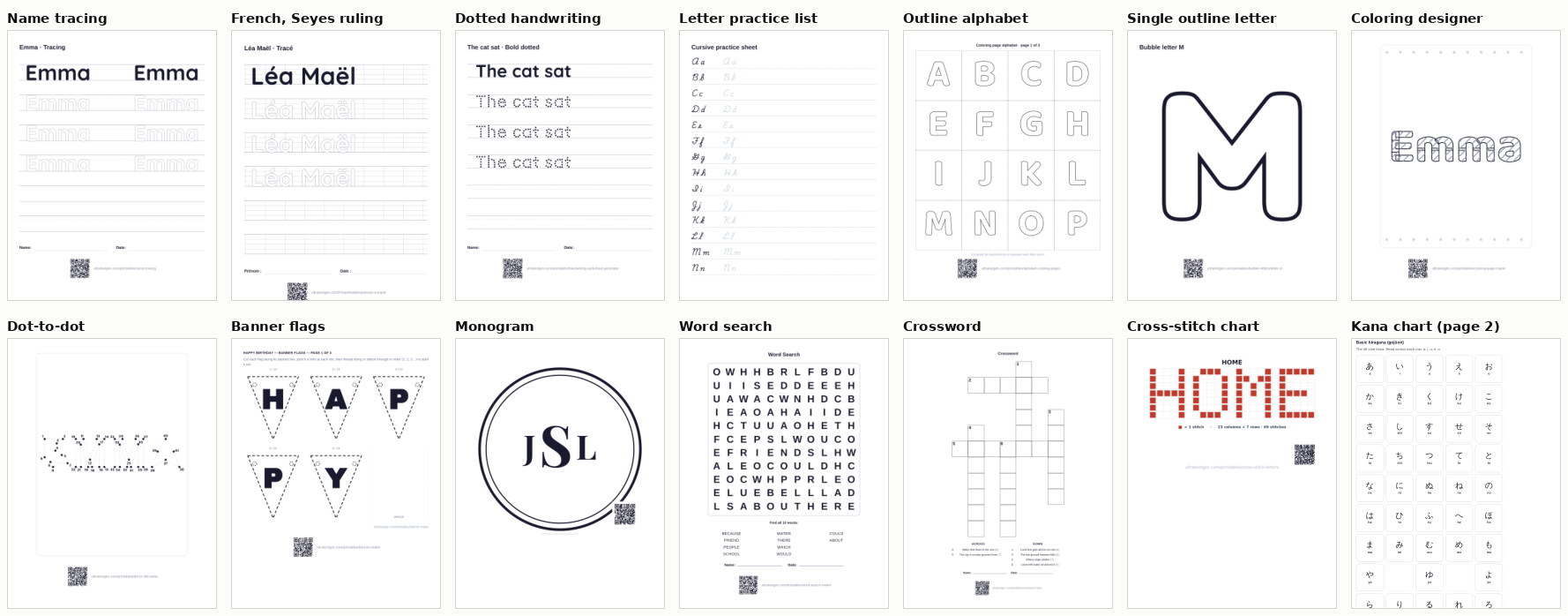
- 54 test cases from 40 printable pages, 82 printed sheets in all: name and word tracing, handwriting and letter tracing, practice lists, outline alphabets and single letters, coloring pages, dot-to-dot, display lettering, word search, crossword, word scramble, cross-stitch charts and two Japanese kana charts. The tracing sheets include German, French, Polish, Spanish and Turkish versions on A4; English sheets were printed on US Letter. Each case was exported unchanged and under up to 15 treatments, including the site's own Ink saver and High contrast settings: 1,113 measured exports.
- What was measured
- The weighted darkness of every exported sheet, and how much of it each part carries; the contrast and visibility of each part against a bar set in advance for its worksheet type; how each part survives a simulated photocopier; and, for tracing sheets, how guides and trace letters look through a simulated printer screen.
- What it can conclude
- Which treatments keep each tested worksheet type working on the exported file, how much darkness each removes, and which verdicts sit too close to a threshold to call.
- What it cannot conclude
- How much ink or toner any treatment saves, what a saving is worth in cartridges or money, how real printers and copiers reproduce faint marks, or how teachers, parents and children judge the sheets.
The treatments
Three treatments carry most of the findings. Plain names are used on this page; the data files use the identifiers in brackets.
- Broad fade (
broad_fade_72). The site's existing Ink saver setting: every letter, line and grid the sheet draws is printed at 72% opacity. Text set as ordinary page text is not touched. - Page-wide fade (
page_wide_fade_75,page_wide_fade_60). The whole page at 75% or 60% opacity, including tile borders, cut lines and page text. - Role-aware (
role_aware_75). Only dark marks (darker than mid-gray) in the example row, the heading and the trace rows are lightened, to 75% of their darkness as a solid color. On a sheet with pale trace letters, that means the example row and the heading change and nothing else. It never touches ruled guides, the tinted guide band on German sheets, the name and date line or the credit code.
Every treatment tested, with its data identifier
| Treatment | What changes | Identifier |
|---|---|---|
| Standard | Nothing: the sheet as exported | standard |
| Broad fade | Letters, lines and grids the sheet draws at 72% opacity | broad_fade_72 |
| Page-wide fade | Every page at 75% or 60% opacity, borders and page text included | page_wide_fade_75, _60 |
| Role-aware | Dark marks in the example row, heading and trace rows to 75% strength as a solid color | role_aware_75 |
| Role-aware, all content | The same 75% tint on dark marks anywhere on the sheet except guides, the name line and the credit code | role_aware_75_all_content |
| Lighter dark marks | Every dark mark to 75% or 60% strength, credit code included (one version keeps the code) | lighter_dark_marks_75, _60, _75_keep_qr |
| Lighter color, everything | Every color on the sheet to 75% strength | lighter_color_75_all |
| Lighter fills | Filled areas to 55% strength | lighter_fills_55 |
| Display letters at 55% | Solid display letters to 55% strength | display_letters_55 |
| Solid to outline | Solid letters redrawn as outlines | solid_to_outline |
| Credit code removed | The QR code hidden, to measure what it costs | credit_qr_removed |
| Regular-weight grid letters | Word search letters at regular rather than bold weight | regular_weight_grid_letters |
| High contrast | The site's photocopy setting: darker, bolder guides and marks | high_contrast |
| Early role rule | A first version of the role-aware rule, replaced after review because it also lightened the credit code | early_role_rule_75, _60 |
Strength means how much of a mark's darkness is kept: a mark at 75% strength is 75% as dark against the paper as before. A fade does this by making the mark partly transparent; a solid tint does it by mixing the mark's color with white. On white paper the two print the same tone.
Results by worksheet type
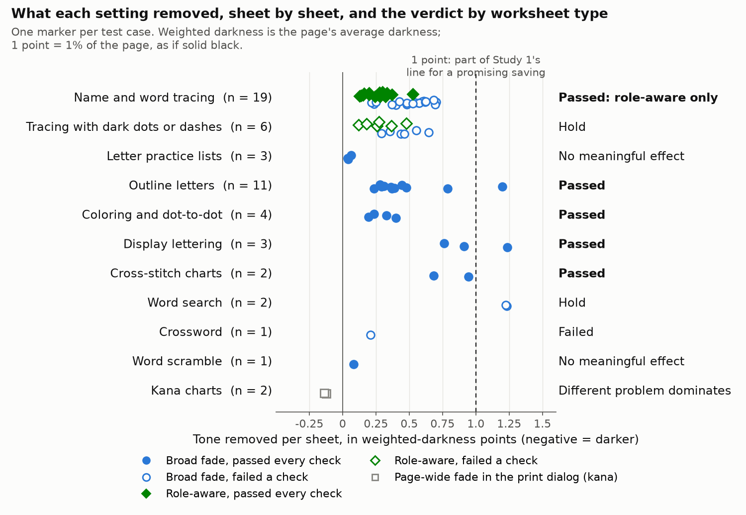
Five worksheet types passed a tested treatment. Two could not be settled without a physical test, three had nothing useful to gain or failed, and on one the page layout mattered more than any ink setting.
| Worksheet type and verdict | What carries the task | Tested result | Tone removed | Evidence strength | Recommendation |
|---|---|---|---|---|---|
| Passed a tested treatment | |||||
| Name and word tracing 19 cases Passed: role-aware only | Pale trace letters and ruled guides the child writes on; the dark example row shows the target. | Broad fade failed 19 of 19: it faded the pale marks the sheet exists for. Role-aware passed 19 of 19, with guides and trace letters unchanged. | Medium: 19 cases in six languages; no person has rated the lighter example row. | Keep guides and trace letters at full strength. If anything is lightened, lighten the dark example row and heading only. | |
| Outline letters 11 cases: 6 alphabets, 5 single letters Passed | The hollow letter outline a child colors, traces or cuts out; tile borders and dashed cut lines. | Broad fade passed 11 of 11. A page-wide fade, which also fades tile borders and cut lines, failed 5 of 6 alphabets. | Medium: 11 cases. On the two alphabets checked at three thresholds, the copy result sits near its bar at the strictest one. | A moderate fade of the letter outlines is acceptable. Keep cut lines and tile borders at full strength. | |
| Coloring and dot-to-dot 4 cases Passed | Outlines to color inside; dots and the numbers beside them. | Broad fade passed 4 of 4. The credit QR code carries 19 to 37% of these sheets' tone. | Low to medium: 4 cases; nobody colored in over paler outlines. | A fade is acceptable, but there is little to gain. | |
| Display lettering 3 cases: banner, 2 monograms Passed | Solid letters: the fill is the design. Cut and punch marks. | Broad fade passed 3 of 3, letters at 6.8 to 6.9:1 contrast. At 55% strength the letters fell to 3.9:1 and failed the 4.5:1 bar. | Low to medium: 3 cases; the monograms are drawn on a canvas. | A moderate fade is acceptable. Stop well short of 55%. | |
| Cross-stitch charts 2 cases Passed | The stitches are the chart, in the color the user chose. | Broad fade passed 2 of 2. A 55% version failed the contrast or copy check. | Low: 2 cases, drawn on a canvas. | A moderate fade is acceptable. | |
| Hold: needs a physical test | |||||
| Tracing with dark dots or dashes 6 cases Hold | Dark dotted or dashed letters to trace over, plus ruled guides. | Broad fade failed 6 of 6. Role-aware failed 6 of 6: the dark dots lighten with the example row. After one simulated copy they kept 0.87 to 0.95 of their marks against a 0.90 bar: too close to call. | Low: 6 cases, one per trace style. | Leave unchanged until a real copier settles it. | |
| Word search 2 cases: one layout, two levels Hold | A dense grid of bold letters: the darkest sheet tested, at 4.85 to 4.88%. | After two simulated copies the broad fade kept 0.93 to 0.94 of the grid's marks against a 0.95 bar: too close to call. Thinner letters failed clearly, at 0.74. | Low: one layout. | Leave unchanged until tested on real copiers. It is the largest possible saving in the set, so it is worth testing. | |
| No meaningful effect, or failed | |||||
| Letter practice lists 3 cases No meaningful effect | Model letters set as page text, with pale trace letters beside them. | The broad fade removed 0.04 to 0.06 points, because the model letters are page text it does not reach. No passing treatment removed more than 0.25 points. | Medium: 3 cases, and the result follows from how sparse the sheets are. | No ink-saving treatment. There is nothing material to save. | |
| Word scramble 1 case No meaningful effect | Scrambled words and pale answer lines. | The broad fade removed 0.08 points and passed. A page-wide fade faded the answer lines and failed. | Low: 1 case. | No ink-saving treatment. | |
| Crossword 1 case Failed a function check | Thin cell borders and small clue numbers. | Every treatment that lightened the grid failed the copy check. After two simulated copies the broad fade kept 0.56 to 0.85 of the grid's marks against a 0.95 bar, at every threshold. | Low to medium: 1 case, but it fails at every threshold. | No ink-saving treatment. | |
| A different problem dominates | |||||
| Kana charts 2 cases: hiragana, katakana Different problem dominates | Kana glyphs, small gray romaji and pale cell borders, printed from the browser's print dialog. | A page-wide fade made the pages 16 to 19% darker, not lighter. Lightening dark marks failed the copy check. Both charts print a title-only first page. | Medium: 2 charts, checked on A4 and US Letter. | Fix the page layout first: it saves 1 sheet in 5. No ink-saving treatment. | |
Points are percentage points of weighted darkness per printed sheet. The range bar runs from 0 to 1.5 points; the tick marks the median. Gray bars are savings that were possible but are not recommended. "Passed" means every check set in advance for that worksheet type passed on every case; pass and fail counts use the main visibility threshold, 0.15. Full per-case rows are in results-by-case.csv.
Tracing sheets: a worksheet is not one visual object
A name tracing sheet has four parts that matter. The heading says what the sheet is. The example row shows the name in solid dark letters, as the target. The trace rows repeat the name in pale letters for the child to write over. The writing guides are the pale ruled lines that set how tall each letter should be. The pale marks are not decoration: they are the task.
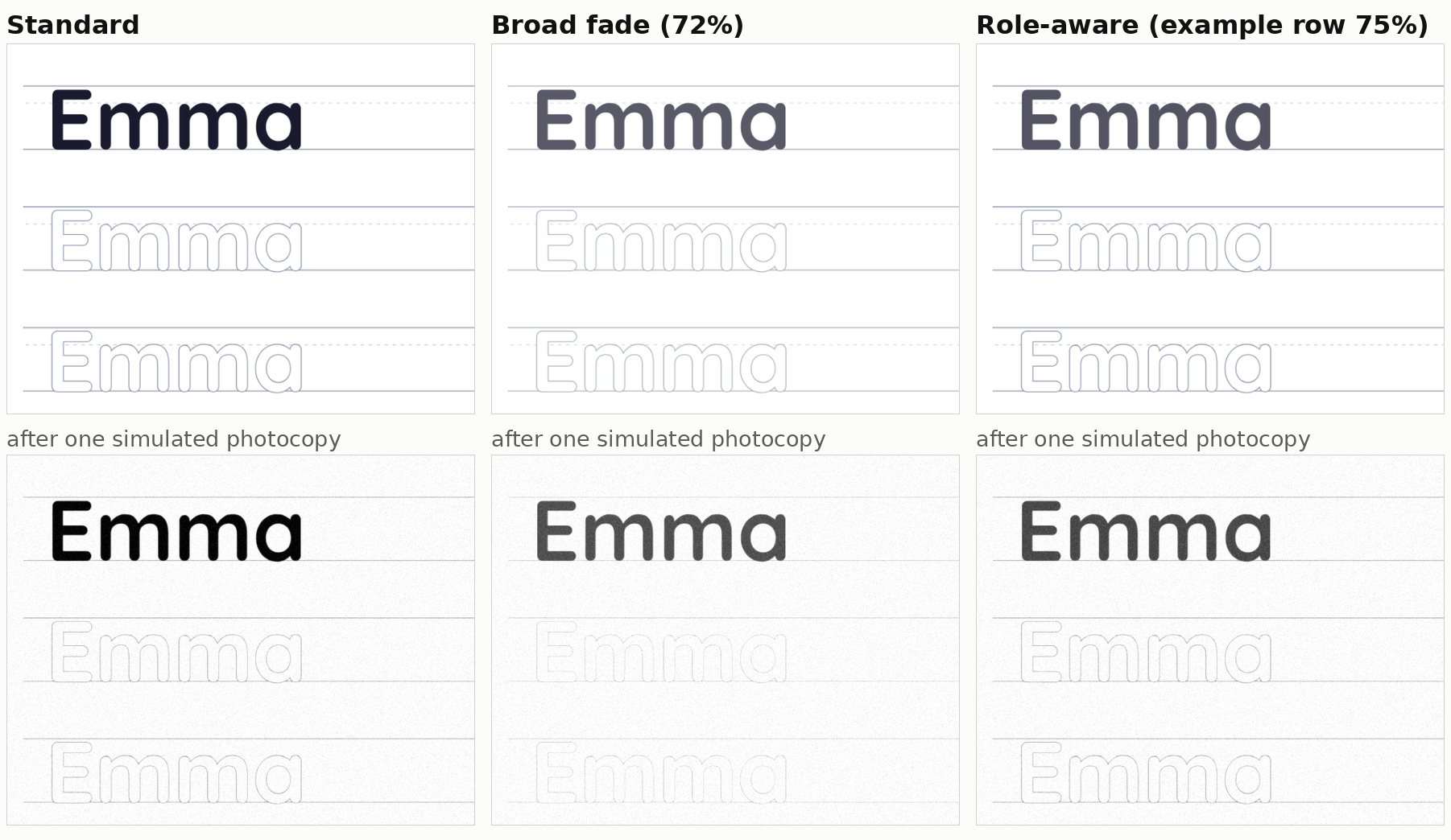
A broad fade treats all four the same, so the pale marks get paler. The role-aware rule lightens only the dark parts, which carry much of the tone, and leaves the pale marks alone.
| Part of the sheet | Standard | Broad fade | Role-aware |
|---|---|---|---|
| Heading says what the sheet is | Full | Unchanged | 75% |
| Example row the target to copy | Full, 17.1:1 | 72%, 6.9:1 | 75%, 7.6:1 |
| Trace rows pale letters to write over | Pale | Paler | Unchanged |
| Writing guides set the letter height | Pale | Paler | Unchanged |
| Name and date line | Full | Unchanged | Unchanged |
| Credit QR code | Full | 72% | Unchanged |
Measured on the default name tracing sheet. Contrast is the example row's darkest letters against white paper. The swatches show the printed tone of each part.
- Function check
The broad fade failed all 19 name and word tracing cases. All 19 failed on their trace letters, and the 13 ruled sheets on their guides as well. On the clean export, trace letters lost 14 to 28% of their tone step (how much darker than the paper they print) and guides 26 to 28%, against a limit of 10%.
- Simulated
After one simulated photocopy, the faded pale marks largely disappear. On the default name tracing sheet, 46% of the guide marks and 47% of the trace-letter marks stay visible on a copy of the unchanged sheet; under the broad fade, 10% and 7% do. Across three visibility thresholds and five copier noise seeds, the faded guides and trace letters kept 0 to 69% of the unchanged sheet's visible marks (bar: 90%). The copier seeds changed no ratio by more than 0.011.
- Simulated
Through a simulated laser printer screen, the broad fade made pale guides and trace letters about 31 to 40% fainter on the three sheets measured this way (typed name, cursive name and faded handwriting). The role-aware rule left them exactly as they were. Whether that loss is visible to a child on paper is a physical question.
- Function check
The role-aware rule passed all 19. Guides and trace letters print exactly as on Standard and are unchanged through the simulated printer screen; after simulated copies they kept 96 to 100% of Standard's visible marks at every threshold tested. The example row goes from 17.1:1 to 7.6:1 contrast, which is still above the 7:1 level WCAG treats as enhanced contrast.
- Measured
It keeps about half the saving. The role-aware rule removed 0.13 to 0.53 points (median 0.28), 28 to 75% of what the broad fade removes on the same sheet (median 53%). It works because the example row is the largest single user of tone on most tracing sheets: 18 to 67% of it.
- Interpretation
Other rules that leave the pale marks alone also passed. Lightening every dark mark to 75%, credit code and name line included, passed 19 of 19; at 60% it passed 18 of 19 and removed up to 0.97 points, with the default navy example row down to 4.5:1. The role-aware rule is the narrowest of them: it changes only the parts whose job survives being lighter. No treatment that passed on any tracing sheet, dark-dot sheets included, removed a full point.
What the tracing result does not settle
- Unresolved
Nobody has judged a lighter example row. 7.6:1 is a measured contrast, not a teacher's or a child's verdict, and low-vision readers were not consulted.
- Unresolved
User-chosen colors need a guard that was not tested. On a bubble name sheet where the user had chosen a pink example row, the role-aware rule lightened the pink too, to 3.7:1 by our contrast measure. A working rule would have to leave a user's own color alone.
- Unresolved
Sheets with dark dotted or dashed trace letters are a hold, covered under Not settled.
How little there is to save
Weighted darkness (WD) is the average darkness of the page, from 0% for blank paper to 100% for solid black. A sheet at 2.38% WD is, averaged over the whole page, as dark as if 2.38% of it were printed solid black and the rest left blank. A saving of 0.3 points takes that sheet to 2.08%.
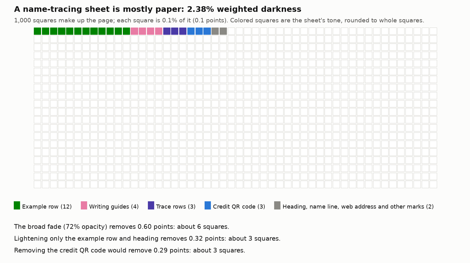
- Measured
Every sheet tested is sparse. The 54 unchanged cases range from 0.40% WD (a letter practice list) to 4.88% (the hard word search). None has a background tint, photo or decorative fill, which are the parts where Study 1 found its largest savings.
- Measured
Passing a check and being worth doing are separate findings. Study 1 called a saving promising when it removed at least 15% of the page's tone and at least 1 point. At the 72 to 75% strengths, only two sheets reach 1 point with every check passed: the single bubble letter M (1.20 points under the broad fade) and the circle monogram (1.24). Stronger 60% fades and redrawing solid letters as outlines reach a point on a few display and single-letter sheets, but the 60% fades failed most outline, coloring and cross-stitch cases, and an outline banner is a different design.
- Measured
No treatment that passed on a tracing sheet crossed 1 point. The most was 0.97.
- Measured
Study 1's four-color estimate overstates savings on these sheets. The sheets print in a dark navy, not pure black, and the naive four-color split Study 1 used counts that navy as about 168% coverage. Relative savings measured that way came out 1.19 to 2.06 times the weighted-darkness figures, which is why this study ranks by weighted darkness. Measured the four-color way, the role-aware rule is "promising" on 7 of the 19 tracing cases; measured by darkness, on none.
- Interpretation
Do not read these points as ink. How much ink or toner a printer lays down for a given darkness depends on the printer, the mode and the kind of mark: laser toner use per covered area differs between solid areas, halftones and text edges. A sheet 0.3 points lighter may use less ink or toner, but by an amount this study cannot state.
- Unresolved
The ink color itself was not tested. The sheets print in a dark navy, not pure black. Whether common inkjet printers build that navy partly from color inks, and so whether printing the same marks in pure black would use less color ink with no visible change, needs a printer.
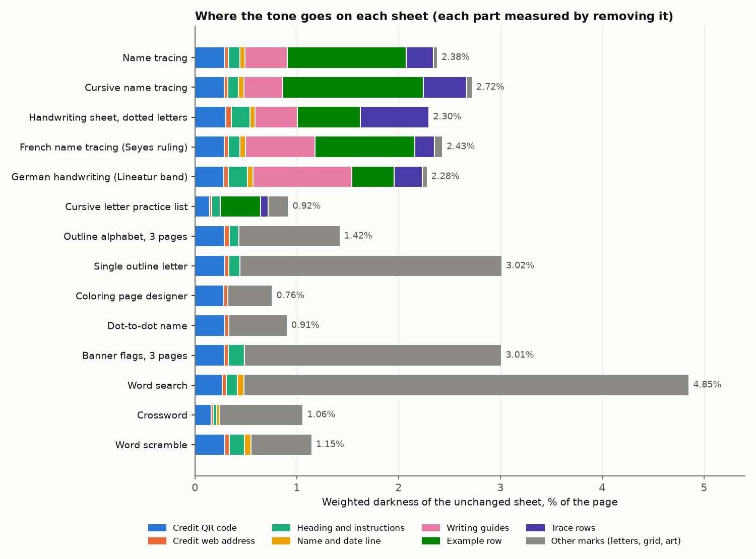
A fixed cost on every page: the credit code
Every sheet the site exports carries a small credit: its web address and a QR code linking back to the tool. The code is solid dark squares, so it is dense.
- Measured
The QR code costs about 0.27 to 0.30 points on each page that carries it. That held on 43 of the 48 sheets where it could be measured; the other five came to 0.06 to 0.16 points, mostly where one code serves a job printed across several sheets. It is 5 to 37% of a sheet's tone: 19 to 37% on coloring and dot-to-dot sheets, which have little else on them. On canvas-drawn sheets the code could not be measured separately.
- Measured
It is comparable to the whole saving on tracing sheets. On the default name tracing sheet the code is 0.29 points; the role-aware rule saves 0.32.
- Interpretation
A fixed cost behaves differently from a proportional one. A fade takes a share of whatever is on the page, so on a sparse page it takes little. A fixed element costs the same on every page it appears on, so the sparser the page, the larger its share. Where a page is nearly all line work, printing a fixed element once per job rather than once per page, or not at all, would move the total more than any fade. A QR code also has a minimum printable size to keep it scannable, so shrinking it is limited.
- Unresolved
The code also has a purpose: it credits the source and brings people back to the tool. Weighing that against its tone is not something a tone measurement can decide, and this study does not recommend what to do with it.
Print efficiency is more than ink: the kana charts
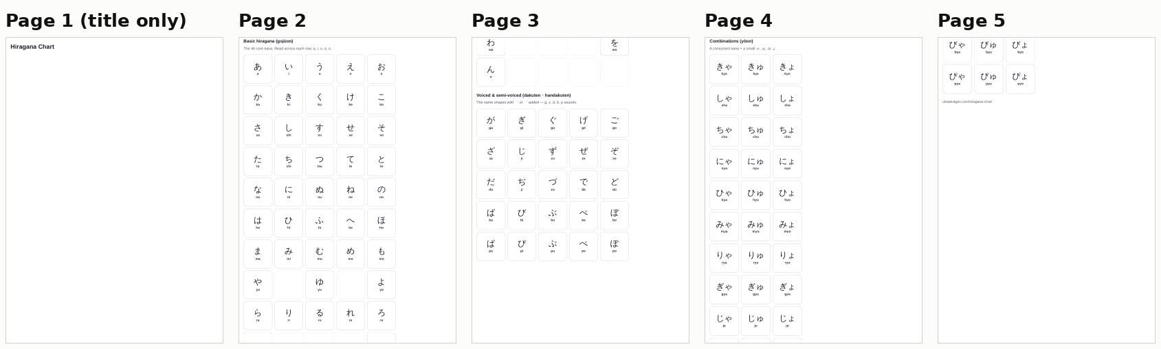
The hiragana and katakana charts print through the browser's print dialog rather than the Download PDF button. Both printed 5 sheets on A4 and on US Letter, and on both, the first sheet carries only the chart's title: the first section of the chart is taller than what is left of the first page, and the print styles keep a section from breaking across pages, so the whole section moves to page 2.
- Measured
One sheet in five is wasted, on both charts and both paper sizes. The charts are already among the lightest sheets tested (0.71 to 0.78% WD), so no ink treatment on them could save anything close to a whole sheet of paper.
- Measured
A fade made these pages darker. Applied as page opacity through the print dialog, a 75% fade raised the charts' weighted darkness by 16 to 19%: the browser painted a gray panel behind the faded content. The same fade applied inside the Download PDF path did not do this.
- Interpretation
Check the page count before the ink. Blank or near-blank pages, orphaned headings and sections pushed onto a new sheet cost a whole sheet at once, which is more than any darkness setting on a sparse page.
High contrast and ink saving solve opposite problems
The site's printables also offer a High contrast setting, meant for sheets that will be photocopied. It darkens and thickens the pale marks so a copier does not drop them. That is the opposite trade to ink saving, and the two cannot be switched on together.
- Simulated
Pale guides are fragile even on the unchanged sheet. After one simulated copy, 41 to 49% of the guide marks stay visible on 11 of the 13 ruled tracing sheets, 25% on the French sheet with Seyes ruling and 3% on the long-sentence sheet, whose guides are finer. Under High contrast, 97 to 100% do.
- Measured
It costs darkness. High contrast added 12 to 127% to the weighted darkness of the name and word tracing sheets: most on ruled sheets, and the most on the French Seyes sheet, whose ruling is dense.
- Interpretation
Choose by what happens to the sheet next. A sheet printed once and handed to one child can afford pale marks; a master that will be copied for a class needs dark ones, and there no ink-saving treatment is appropriate for tracing sheets.
When no ink-saving treatment is the right result
No ink-saving treatment is sometimes the correct result, for three different reasons.
- Nothing to save
Letter practice lists and the word scramble. The practice lists are the sparsest sheets tested (0.40 to 0.92% WD), and their model letters are page text the broad fade does not reach, so it removed 0.04 to 0.06 points. The scramble lost 0.08. A setting that changes nothing visible still invites a user to believe it helped.
- It breaks the task
The crossword. Its thin cell borders and small numbers failed the copy check under every treatment that lightened the grid, at every threshold. A crossword whose grid fades on the copy cannot be solved.
- Something else matters more
The kana charts. A whole sheet of paper is at stake in the layout, and the only fade available on that print path made the pages darker.
What the study could not settle
A result within 0.05 of its bar at any of the three visibility thresholds tested is a hold: the simulated copier cannot decide it, and a real one has to. Holds are not recommendations in either direction.
- Hold
Tracing with dark dotted or dashed letters (6 cases). These sheets trace over dark dots or dashes instead of pale letters. Lightening the example row lightens the dots with it, because both are dark; lightening the example alone would leave the dots darker than the example, the wrong way round. After one simulated copy the dots kept 0.87 to 0.95 of their marks against a 0.90 bar. Only under a looser rule written after the first results did 5 of the 6 pass, and that rule is reported but not counted.
- Hold
Word search (one layout at two levels). The densest sheet and the largest possible saving: 1.23 points under the broad fade. After two simulated copies the letter grid kept 0.93 to 0.94 of its marks against a 0.95 bar. Printing the letters at regular rather than bold weight failed clearly (0.74).
What this means for worksheet creators
These principles come from the measurements above. They describe the tested sheets and a simulated copier, not a physical printer test.
- Name the job of each part before lightening anything. Ask which marks the child uses to do the task (trace letters, guides, cut lines, grid borders) and which only show or label it (the example, the heading). Lighten only the second kind.
- Never fade the pale marks. Guides and trace letters are already near the point where a copier drops them. On the tested sheets, fading them further failed every time.
- Where the dark marks are the design, a moderate fade is fine. Outline letters, coloring pages, display lettering and cross-stitch charts all passed at 72%. Stop before 55%: solid display letters fell below the 4.5:1 contrast bar there.
- Keep structure at full strength. Cut lines, tile borders, crossword cell borders and answer lines failed when faded.
- If the sheet will be photocopied, print it darker, not lighter. A copy master is the opposite case from an ink-saving print.
- Look for fixed elements and wasted pages first. A logo, QR code or border repeated on every page, or a page that carries only a title, can cost more than any fade saves on a sparse sheet.
- Accept that some sheets have nothing to save. A sheet at under 1% darkness gains almost nothing from any treatment.
Printing worksheets yourself? How to Save Printer Ink on Worksheets turns this research into steps.
What this means for UltraTextGen
- Measured
Current behavior. The site's printable tools offer an "Ink saver (lighter lines)" setting, off by default. It is the broad fade tested here. It cannot be combined with "High contrast (for photocopying)". On the tested sheets it passed on outline letters, coloring and dot-to-dot, display lettering and cross-stitch charts, and failed on every name and word tracing sheet.
- Interpretation
If you print from this site today. Leave Ink saver off on name and word tracing sheets, and switch on High contrast for a tracing sheet you will photocopy. On outline letters, coloring pages, display lettering and cross-stitch charts, Ink saver passed every check, though it saves little.
- Product implication
A research candidate, not a change. On name and word tracing sheets, a role-aware rule in place of the broad fade removed the measured harm and kept about half the saving. It has not been built. Before it could be, a person would need to judge the lighter example row, including low-vision readers, and user-chosen colors would need a guard.
- Product implication
Where the setting does little or harm. On practice lists and the word scramble it changes almost nothing, and on the crossword it fails the copy check. Whether the setting should appear on those tools is a product decision this study informs but does not make.
- Unresolved
Still open. Dark dotted tracing and the word search need a physical copy test. The credit code's cost is measured; what to do about it is not a tone question. The kana charts' layout wastes a sheet on both paper sizes. Nothing records whether anyone uses the Ink saver setting at all.
- Not tested on printers
Next. Printing and weighing on real printers, copying on real copiers, and asking teachers to rate sheets are the tests that would turn these results into ink claims. None has been run.
What the study cannot tell you
- No ink, toner, cartridge or cost figure. Every figure is weighted darkness on the exported sheet. No ink or toner was weighed, and no saving here should be read as ink, toner, cartridge yield, page yield or money.
- No physical printers or copiers. The copier is Study 1's model and the printer screen is a simulated laser-class screen (600 dpi, 106 lines per inch); neither was fitted to a real machine. Inkjet printers render thin gray lines differently.
- No people. No teacher, parent, child or low-vision reader rated any sheet. "Works" here means measured contrast and visibility against bars set in advance.
- Near-threshold verdicts are not settled. Dark dotted tracing and the word search are holds. The outline alphabets' copy result also sits close to its bar at the strictest threshold, and other verdicts could move with a different copier.
- Only what exists was tested. Some worksheet types rest on one or two cases (crossword, word scramble, cross-stitch, the monograms). Tracing sheets exist only in Latin script, so Arabic, Devanagari, Cyrillic or Thai tracing sheets could not be tested, and their small detached marks are exactly the kind this study found fail first. Two other print surfaces were not measured. Bulletin-board sizes, landscape pages and narrow margins were not exercised, and each case was tested in one layout.
- The Download PDF export is an image. The site's PDF export rasterizes each sheet (288 dpi, 192 dpi above four pages), so these results describe that file. The kana charts went through the print dialog instead, where a fade behaved differently.
- No usage data. Page counts are not usage: nothing here says which worksheet types people print most, or whether anyone uses the Ink saver setting.
- Criteria were set before the results, but not locked in a file at the time. The order cannot be verified independently. Two changes made after the first results are disclosed under Method; neither decides any verdict.
- Pooled marks on some types. On outline, puzzle and cross-stitch sheets, "tile borders", "cell borders" and "answer lines" were not measured one by one; which of them failed is inferred from what a treatment touched.
- Language and paper are confounded. Every non-English sheet was printed on A4 and every English one on US Letter.
- One ink color. Every sheet prints in the site's dark navy. Pure black or colored marks could behave differently on a real printer.
Help settle the open results. The two holds need a real photocopier, and the lighter example row needs teachers, including teachers of low-vision readers, to judge it.
- Offer a photocopier for the copy test: the word search and a dark dotted tracing sheet, copied on a real machine.
- Review a tracing sheet as a teacher.
Both links open an email to [email protected]. Results you send are published in the next version of this study, credited to you if you want.
How the study was run
Real output
Every sheet was exported from the live site's code through the same path a visitor uses: the Download PDF button, which draws each sheet in the browser and saves it as an image-based PDF at 288 dpi (192 dpi for jobs above four pages). Each treatment was applied to exactly the page content the export copies, just before it was drawn. The two kana charts, which have no Download PDF button, were printed through Chromium's print dialog with background graphics off, the browser default. The browser was Chromium driven by Playwright 1.56. The two canvas-drawn tools (monogram and cross-stitch) could be captured only with their own settings; other treatments on them were simulated on the exported image and are labeled that way in the data.
Weighted darkness
Each PDF was rasterized at 150 dpi. Weighted darkness is the mean of 1 minus luma (Rec. 709) over the page, reported as a percentage. Each part's share was measured by exporting the sheet again without that part and taking the difference. Study 1's other coverage estimates, including total tonal coverage, were computed on every export and are in the data for comparison.
Function checks
Each worksheet type has its own checks, set before the treatment results were read. Tracing sheets: guides and trace letters must keep at least 90% of their tone step and of their visibility after one simulated copy, the example row must stay at 3:1 contrast or more, and trace letters must never print darker than the example. Practice lists, outline letters, coloring and dot-to-dot, and cross-stitch: marks must keep 90% of their visibility after one copy and 3:1 contrast. Display lettering: 4.5:1. Grid puzzles and kana charts: 4.5:1 and 95% of their visibility after two copies. Contrast uses the WCAG 2.2 ratio of each part's darkest tenth of pixels against white paper, a screen standard used as a proxy for print.
Simulated photocopies and printer screen
The copier is Study 1's model: a 0.10 mm blur, anything lighter than 0.90 luma mapped to paper and anything darker than 0.10 to solid black, plus noise, for two generations. A pixel counts as visible when it is at least 0.15 darker than paper; each part's visible share is compared with the unchanged sheet's own copy. Verdicts near a bar were re-run at thresholds of 0.08, 0.15 and 0.25 and with five copier noise seeds. The printer screen is Study 1's simulated clustered-dot screen at 600 dpi, 106 lines per inch and 45 degrees, viewed with a 0.15 mm blur, applied to the top 62% of page 1 of every tracing sheet.
Criteria, changes and review
- Frozen criteria. The full set of checks is published as criteria.json, frozen so that later tests can be run against it unchanged.
- Changes after the first results. Two rules changed after results were seen, and both are flagged in the data. Where the unchanged sheet already failed a contrast bar (a user-chosen pink at 2.6:1), the test became "at least 90% of Standard's contrast"; this decides no verdict. A looser 3:1 floor for dark marks was tried after the dark dots failed; it is reported as a sensitivity result, never counted as a pass, and the dark-dot sheets remain a hold.
- Capture check. Every treated export was compared with its own Standard to confirm the layout had not changed between captures: 632 captures passed. The check was shown to catch a real error: a dot-to-dot capture that had loaded with a different dot layout, which had produced a false failure, was flagged and re-captured.
- Adversarial review. Before publication an independent AI reviewer, briefed to challenge the study and given the data and code, raised 16 findings. Each was fixed or disclosed; the main changes are listed under Corrections.
How this study relates to Study 1
Study 1 tested methods on synthetic pages built to vary one thing at a time. This study reuses its measures and its copier and printer-screen models, unchanged, on real sheets.
| Study 1 said | On real sheets |
|---|---|
| Sparse line pages under about 3% coverage: leave unchanged. | Consistent. No treatment saves a full point on any tracing sheet. Where a site already offers a fade, the role-aware rule is a lower-harm way to keep it; leaving the sheet unchanged remains the other valid choice. |
| A page-wide 75% fade: consider it only above about 4% coverage, and never on guide-dependent or photocopy pages. | Confirmed for guide-dependent pages: the fade failed every tracing sheet. Refined for the rest: outline, coloring, display and cross-stitch sheets under 4% passed every check, so the 4% line is about whether a saving is worth having, not whether a fade is safe. |
| Handwriting sheets lose their guides on the first simulated copy. | Confirmed on real sheets, across thresholds and copier seeds. |
| Route by what covers the page, not by page type. | Confirmed. On tracing sheets the question is which part carries the tone (the example row) and which carries the function (the pale marks). |
| Removing decoration and lightening fills gives large savings. | Nothing to act on: the tested sheets have no decoration or fills. |
| Total tonal coverage as the headline estimate. | It overstates savings 1.19 to 2.06 times on navy-ink sheets, so this study ranks by weighted darkness. |
Corrections made before publication
- Version 1.0
- : first published version
Review found and fixed these before version 1.0. The first draft recommended a tracing rule that also lightened the credit code and the name line; it was replaced by the role-aware rule and every figure was re-measured. Single-letter pages, the most common printables by page count, had not been exported; six were added (five outline letters and a dot-to-dot letter). The word search and dark dotted tracing moved from recommendations to holds, a 55% option for display lettering that failed its own contrast bar was withdrawn, and Study 1's materiality line was applied to every result. Superseded wording does not appear on this page.
Data and reproducibility
-
Full study, version 1.0
The same text as this page, with title, version and canonical URL on every page.
-
results-by-case.csv
Start here: every case and treatment with its saving, pass or fail, and the checks behind it.
-
test-cases.csv
The 54 test cases: the page, settings, paper, language and number of sheets.
The data are CSV files with one header row. Weighted darkness and savings are in percent and percentage points of the page; in coverage-by-render.csv every coverage estimate is a fraction of the page (0.02 = 2%).
| File | Contents | Size |
|---|---|---|
| results-by-case.csv | 743 rows, one per case and treatment: weighted darkness before and after, points and percent saved, the four-color saving, Study 1's class, pass under the pre-set checks, pass under the post-hoc 3:1 floor, and every check with its value against Standard's | 164 KB |
| test-cases.csv | The 54 cases: worksheet type, description, page and settings, output path, paper, language, printed sheets, canvas and user-color flags | 10 KB |
| tone-by-component.csv | For the 52 exported-button cases: each part's share of the sheet's weighted darkness, measured by removing it, and the broad fade and High contrast changes | 6 KB |
| component-measures.csv | Per case, treatment and part: darkest-tenth and median luma, and the share visible after one and two simulated copies | 175 KB |
| coverage-by-render.csv | All 1,113 measured exports, including the part-removed ones, with every Study 1 coverage estimate as a fraction of the page | 122 KB |
| printer-screen.csv, printer-screen-thresholds.csv | The simulated printer screen on the 25 tracing sheets and two grid puzzles: visible share clean and screened, and median tone steps at three thresholds | 12 KB and 1 KB |
| copy-robustness.csv | Near-bar verdicts re-run at three visibility thresholds and two copy generations: mean, lowest and highest ratio over five copier seeds | 13 KB |
| criteria.json | The frozen checks, measures, materiality classes and the two post-hoc changes | 5 KB |
One row needs care. For the banner at 55% strength, the automated contrast measure reads the full-strength cut lines rather than the letters, so its row in results-by-case.csv shows a pass; the letters' own contrast, computed from their color, is 3.9:1 and fails the 4.5:1 bar, which is the verdict used on this page.
Software: Chromium with Playwright 1.56, Python 3.11 with numpy, SciPy, Pillow, pandas and PyMuPDF; the measurement functions are Study 1's, unchanged. Exports are deterministic for a given version of the site's code and the same browser build. The exported PDFs and the measurement code are not published with this version.
How to cite this study
UltraTextGen Research. “Ink Saving by Worksheet Type: Which Print Treatments Keep a Worksheet Working.” Study 2, version 1.0, September 27, 2026. https://ultratextgen.com/research/ink-saving-by-worksheet-type/
Please cite the version number. A later version will keep this address and state what changed.
External sources
That laser toner use per covered area differs between solid areas, halftones and text, which is why a darkness figure cannot be read as toner, is reported by K. Wong, Estimation of Toner Usage in Xerographic Printing (IS&T, 2008), and by Gao, Ju, Nelson, Prenn and Allebach, Toner Usage Prediction for Laser Electrophotographic Printers (IS&T Electronic Imaging, 2016).
The contrast bars of 3:1, 4.5:1 and 7:1 come from the W3C's Web Content Accessibility Guidelines 2.2, a screen standard used here as a proxy for print.
Copier background suppression, the behavior the simulated copier imitates, is described in Xerox's support article on automatically suppressing background variation.