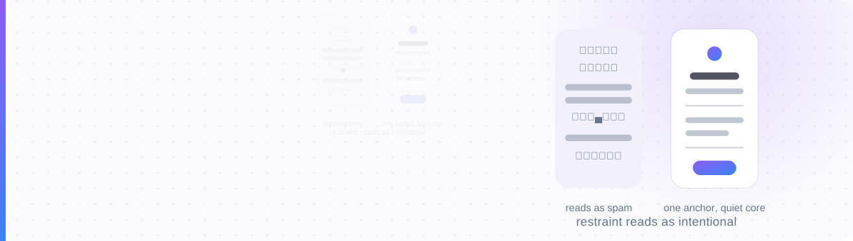
More Decoration Isn't More Personality
Open ten random symbol-dump bios and they start to blur together: a wall of stars, hearts, dividers and hashtag-style emoji stacked with no clear order. The person behind it wanted to stand out. Instead, it reads as a template: the exact opposite of the personality they were going for.
This isn't a matter of taste alone. Dense, undifferentiated symbol use is the visual signature of low-effort and spam accounts, so viewers pattern-match it automatically, and some platforms' own spam-detection systems watch for the same density as one signal among several. The bio doesn't need to say "look at me" through volume. It needs one clear thing that says it, surrounded by room to breathe.
The Restraint Framework
Three moves, applied in order, turn a symbol dump into something that reads as deliberate.
One anchor
Pick a single recurring motif (one emoji that represents your niche, one divider style, one bracket pair) and use it consistently. Not one of everything. One thing, repeated.
A quiet core
Your name, your one-line description, and any link stay in plain text. The core is what a stranger scans first; if it's buried under symbols, the bio has failed its actual job.
Rhythm
Consistent line breaks and spacing beat random symbol placement. A short line, a divider, a short line reads as composed. Symbols scattered mid-sentence read as noise.
The Same Bio, Restrained
─── Portland, OR
New roast every Friday →
Same amount of information, one anchor (☕), a quiet core, and rhythm from the line breaks instead of the symbols. Everything unnecessary is gone; nothing essential is lost.
Spam Signals vs Aesthetic Signals
- Multiple unrelated symbol families stacked (stars, hearts, dividers, kaomoji) with no visual pattern
- Symbols placed mid-word or mid-sentence, breaking readability
- No plain-text anchor a viewer can scan in one glance
- One motif, repeated: never a grab-bag of everything available
- Name, description and link stay in plain, searchable text
- Consistent line rhythm carries the structure, not the symbols
The Budget Changes by Platform
- Instagram & TikTok: the longest character budgets and the most tolerance for structure across multiple lines. Watch for line breaks collapsing on save; see the Save-Proof Bio method.
- LinkedIn: a headline is a single line under intense scrutiny. One small anchor at most; the core needs to carry almost all of the weight. See what recruiters and ATS actually see.
- Discord: the About Me field is short and sits beside a name that may already carry styling; don't stack two anchors on top of each other. See styling a Discord name without getting filtered.
Twenty symbols say "this was dumped."
Restraint is the entire skill.
Build a restrained, on-brand bio
Style a single anchor phrase, keep your name and links plain, and let a divider carry the rest of the structure.
Open the Bio Font Tool →